Web Design Inspiration Curated
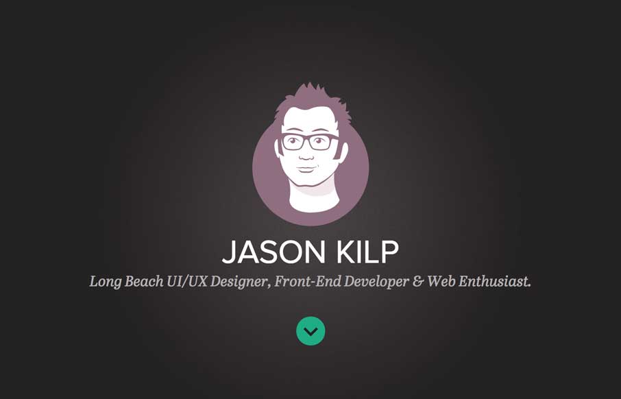
Jason Kilp
Very bold looking layout and approach. Cool loading graphics animations when you first load the page that gets your attention. I like the rest of the load in stuff too as you scroll down with the hover state animations to boot. Good stuff.
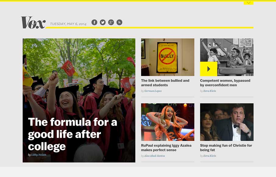
Vox
Nice example of a responsive approach to a new site/blog. It's always great to study how designers approach these same screen size transitions with sites that handle a lot of content.
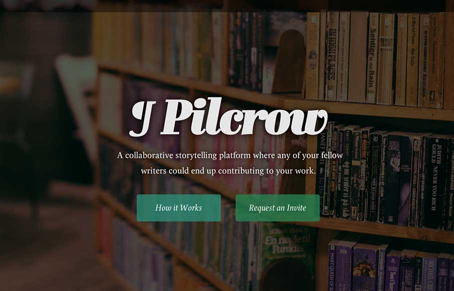
Pilcrow
This is a simple landing page app with a few polished touches that push it beyond your typical static (read: boring) coming soon page. Dive into "How it Works" and you're greeted with a super smooth animation. We're talking about plain white boxes here, but the...
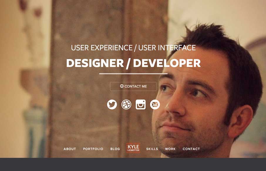
Kyle Ledbetter
Very nice portfolio site design. Chock full of detail work and what you'd expect from a UX designer. Lovely colors and visual pairings as you make your way through the content and skills section.
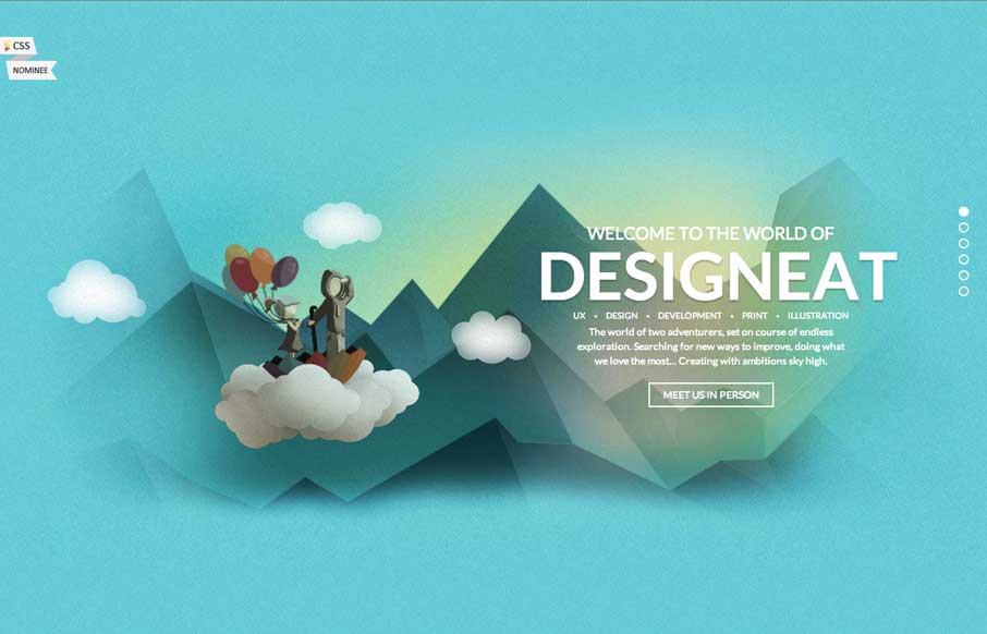
Design Neat
What a fun website. I love the illustrations and the atmosphere they work to set. Beautifully done simple storytelling with just visuals that get you hooked.
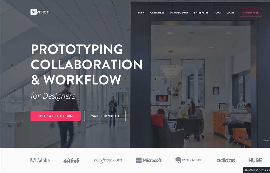
Invision
Nice redesign of the Invision website. I dig the embedded videos down the page. I also think the way they've used the "stories" to display other brands is pretty smart too. Great stuff here.
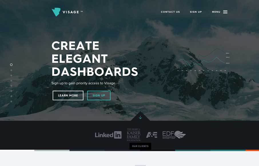
Visage
Man this site is stacked with cool graphics and interaction stuff. I love the color combo and how it's put together. The "menu" link that opens up more nav options while sticking the main two out beside it is so smart. Really beautiful website.
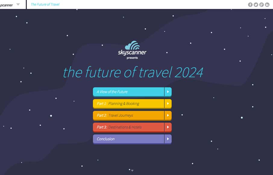
Sky Scanner
Oooh, what a nice site to check out. I luuurve the illustrations and how they're used to tell a story. Beautiful stuff.
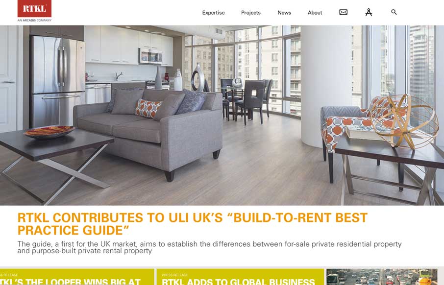
RTKL
Beautiful and simple approach to this site's layout. Cool use of the Masonry like layout below the hero image area too - actually putting it to work via the content too.
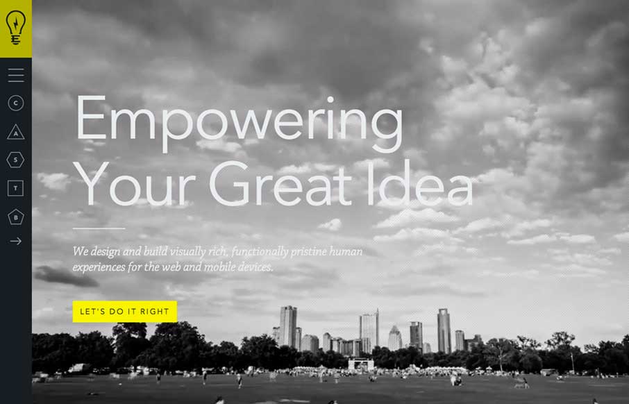
Electrik
Cool vibe to this site. I like using it. The use of the "hamburger" icon to show the names of the pages/sections instead of only relying on the icons is a good idea. I love the yellow and black with the B&W imagery to boot.
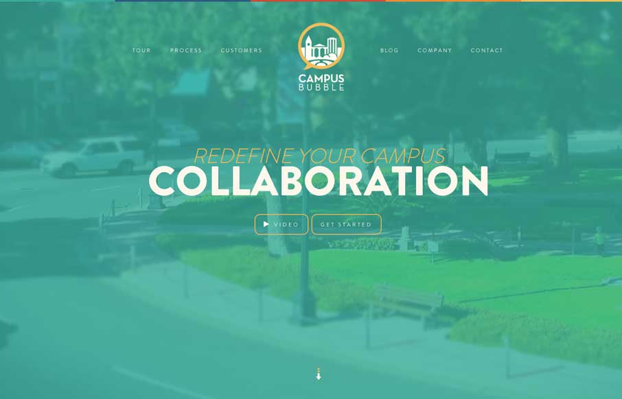
Campus Bubble
Pretty cool visual details built into this site. Like the sped up video in the hero area and all the loading animations as you scroll down. Really great visuals to boot. Winning combo design wise.
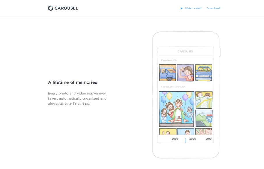
Carousel
Nifty one pager for the Carousel app from Dropbox. Just kinda tells the story and that's all it needs to do.
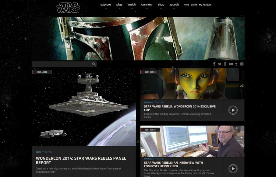
Star Wars
New responsive Star Wars website. Really, over the years this website hasn't been the best looking. I really dig this simpler approach that just puts the imagery and content out there and doesn't try to be too tricky or pretty just with extraneous graphics. Hopefully...
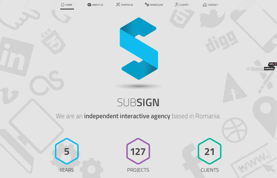
Subsign
As one-page websites become more prevalent, you start looking at them a little differently than when they first started popping up onto the interwebs. I like how clean and minimal the site is which makes it quicker to get to the information they think is important to...
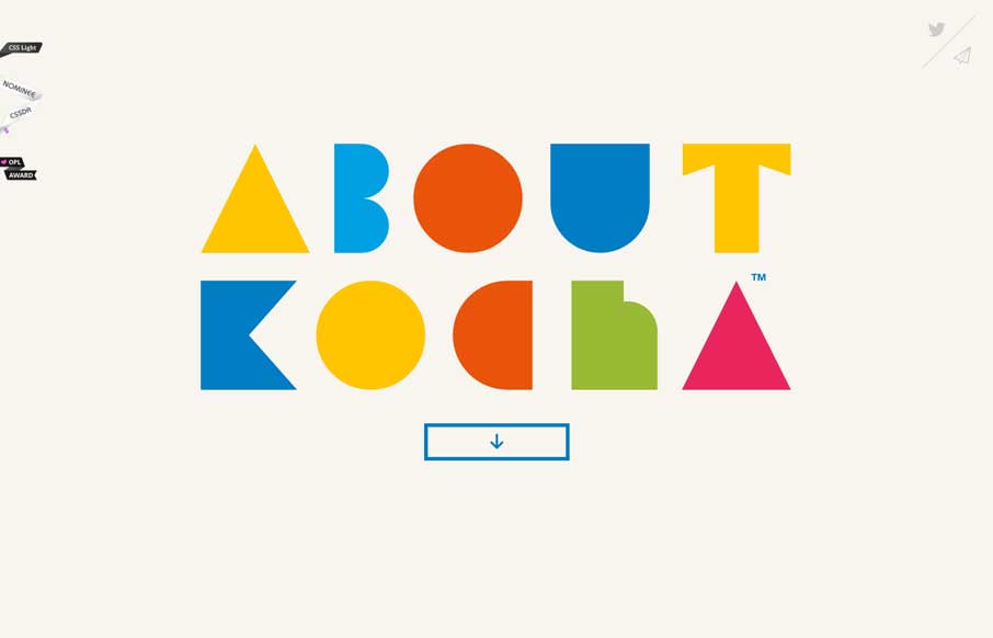
Kocha
Damn I love this website. Just beautiful illustrations supported by a clean design base.
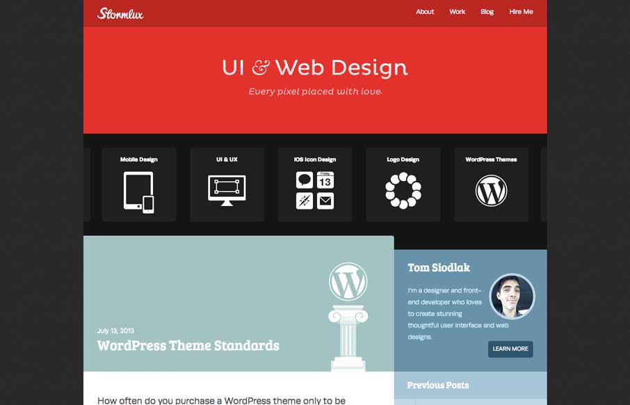
Stormlux
Clever looking design to this website. It wins me over quickly just by feeling unique. I like the way the icons are used to show the core services and with a little explanation. Good work!
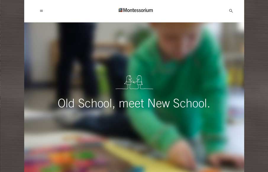
Montessorium
Montessorium is gaining ground in the iTunes store, and their site reflects why. As a parent of three kids who have gone to Montessori schools, we were always looking for ways to bridge the gap between school and home with toys and tools that you would have in the...
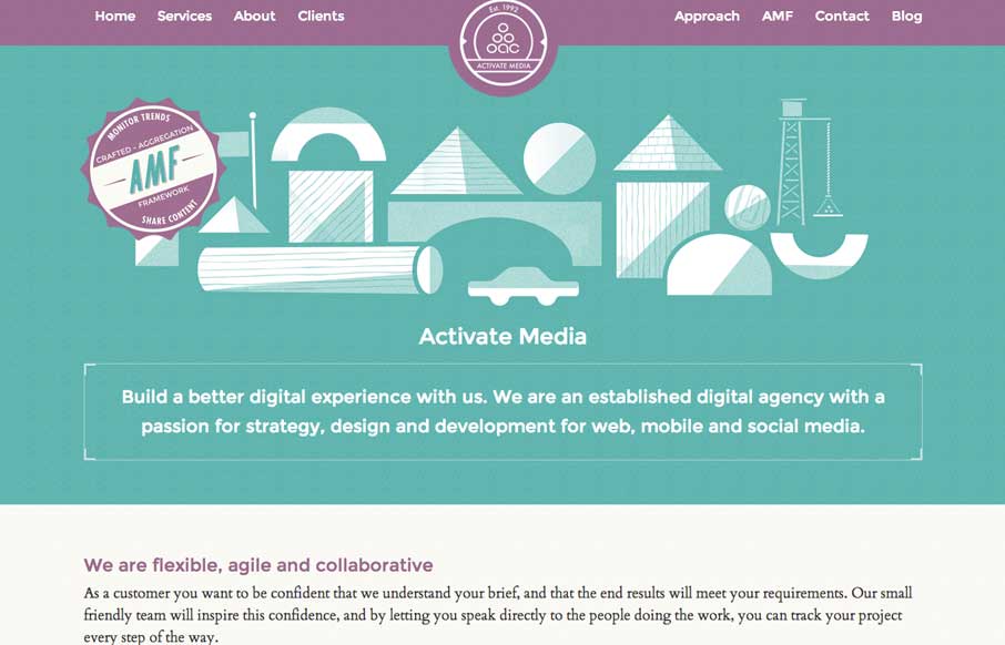
Activate Media
Really cool look & feel + vibe to this site. I love the green and purple and how it works together here with the white lines. Beautiful and clever illustrations help seal the deal on this site.
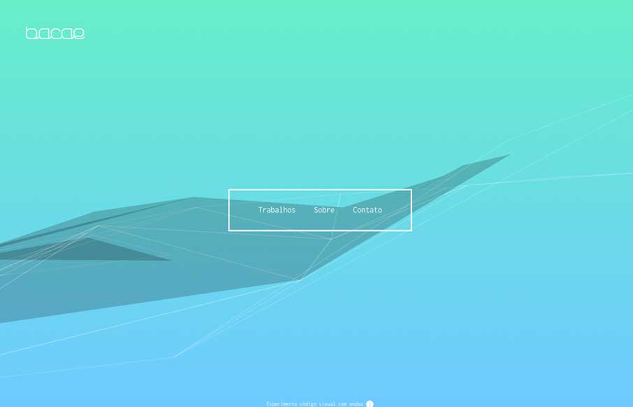
Bacae
Gotta love it when someone pushes the limits on what we do. I love the animation in the background and all the other little details here.

Franny Van Eyck
Nice simple approach to a portfolio website. With some nice little details like forward and back arrows when you're viewing a detail page.
EMAIL NEWSLETTER
News & Articles
InVision: A behind the scenes look
 Get the background on InVision, a prototyping app made by people who believe in prototyping.
Building a Client Logo Grid with Centered Elements
Raise your hand if you've tried to get a grid of client logos to center horizontally and vertically inside each logo's container. It sounds so simple and yet frustratingly it's not. Sure there are some new CSS properties that can help, but they're not supported in...
Skewed Icons: Giveaway
25 icon pack free download from Skewed Icons. Grab e’m while they’re hot.

HARD WORK. CLEAN FUEL. NO EXCUSES
Use “WARRIOR2023″ for 10% off.