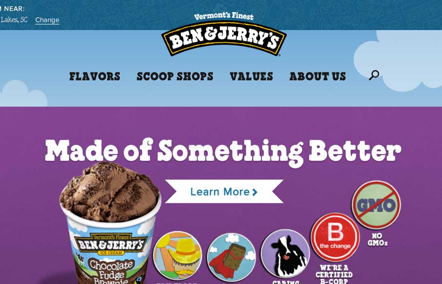
The new Ben & Jerry’s site, done by Happy Cog is super nice. But there’s more here than just a pretty face. There is a ton of strategy behind it and you can feel it as you use the site. Mmmmm Ice Cream….
They have a pretty epic case study and a video about the project, but I like this section the most from it:
Creating a content-driven experience for Ben & Jerry’s meant the website would cater to both users arriving looking to learn more about their favorite flavors and those trying to find the closest 7-Eleven to grab a pint. Users would be able to easily find the information they came for, but popular tasks would remain highly accessible at all levels.
How often is this the case with client projects, it has to accomplish two pretty big tasks and both seemingly at odds with each other. Study this site not only for it’s visual appeal but for the strategy behind it.


0 Comments