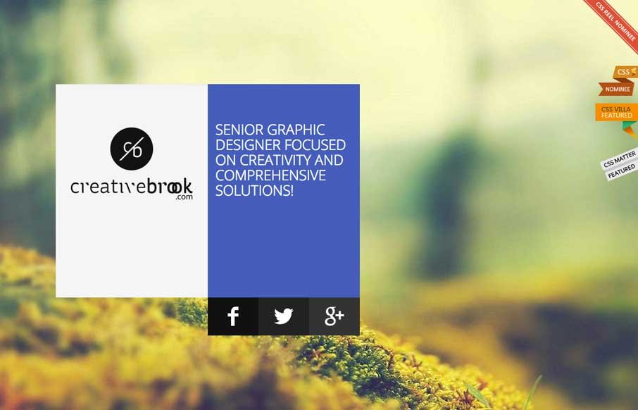
I like the overall treatment to this site design. It feels a bit like Microsoft esthetic (but better executed) which is just fine and looks great here.


The Call to Action, Revisited
The Call to Action hasn’t changed in a decade, but the bar has. A fresh look at prominence, copy, mobile tap targets, and accessibility, with lessons from three major design systems.


You can tell how great they are by all the ribbons from other sites they tacked onto the side.
Those drive me crazy too man.