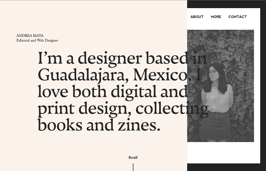
Very cool asymetrical layout for Andrea’s portfolio site. I love the limited color palette and the off kilter typography. Not a huge fan of the mobile size/design, but overall love the look and feel.
Glassmorphism: The Transparent Design Trend That Refuses to Fade
Glassmorphism brings transparency, depth, and light back into modern UI. Learn how this “frosted glass” design trend enhances hierarchy, focus, and atmosphere, plus how to implement it in CSS responsibly.


0 Comments