
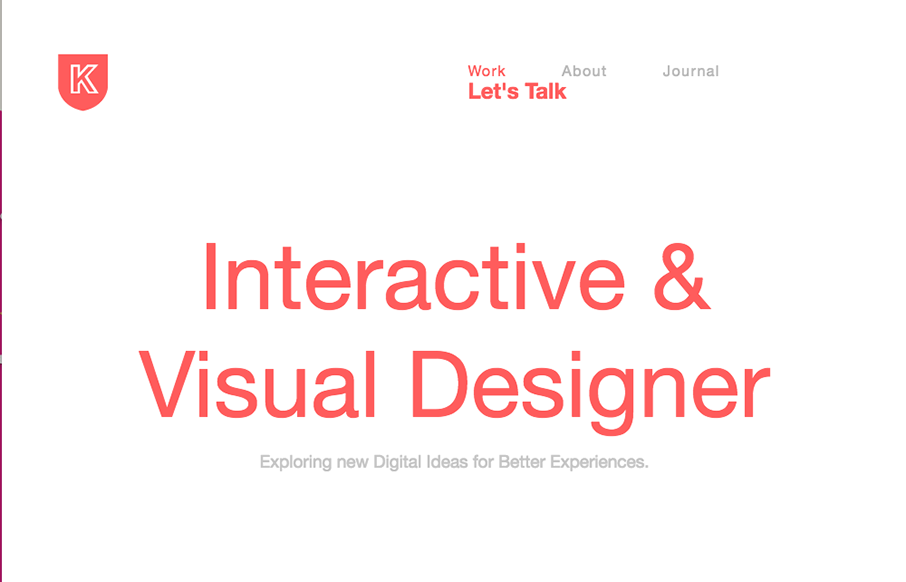
Very slick yet simple layout. I really love the grid-ness of the design. There is also just enough slight movement as you scroll or interact to make it a bit memorable too. Bright colors and strong headlines help a lot too.


Fitts’s Law: Why the Easy Button Wins
Large, close targets are faster to hit than small, distant ones, that’s Fitts’s Law. A look at the 1954 rule behind buttons, prime and magic pixels, thumb zones, and dark patterns.


0 Comments