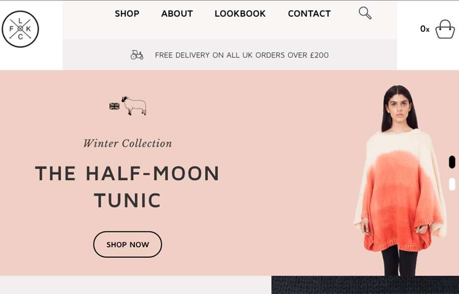
Really cool grid work here. I love the blocky line based layout a lot on this site for Flock Knitwear. The colors some of the subtle off-set-ness. Beautifully done.
Glassmorphism: The Transparent Design Trend That Refuses to Fade
Glassmorphism brings transparency, depth, and light back into modern UI. Learn how this “frosted glass” design trend enhances hierarchy, focus, and atmosphere, plus how to implement it in CSS responsibly.


0 Comments