Cameron McNab

Cameron McNab

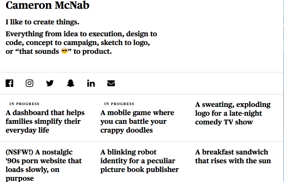
Not much to the site technically but this personal site for Cameron McNab is actually pretty cool. Minimal in it's design approach but cool in it's color shift affect. Pretty nifty idea. From the Designer: A simple take on my personal portfolio. Fully responsive,...

Creative Cruise

Creative Cruise

Really creative approach to a website layout. Very fun and interactive, but for a purpose which gives it a big thumbs up in my book.

Monday

Monday

Just a solid straight forward website design. Everything is placed just right and works like it should. It's beautiful visually and has strong color usage and branding. Just good work that deserves a second look.

Cafe Frida

Cafe Frida

The first thing that hits you is the interaction with the hero area. Flowing the leaves back out of the way draws you in quickly and beautifully. Then as you scroll down you see the clever image use and the way the drop out's are used is quite nice. Really beautiful...

Alec Ortega

Alec Ortega

Damn, that's a solid site design for Alec Ortega's portfolio site. It feels like a product site design, really helps show off his skills in line with your viewing of his work. So solid.

Fluid

Fluid

I can really appreciate the simple approach to this site design. Just big bold areas of content and imagery. I love the way the interaction on the main nav works. Graying out the nav items that you're not mousing on. Good thinking there on the UI.

GO Digital

GO Digital

There is an awful lot going on with this site design for GO Digital. They handle a ton of content and links pretty well visually. I dig some of the interactions and that classic drop down nav just works for all the content. Solid IA under the hood it looks like.

Momentum

Momentum

Really beautiful and simple site for a really beautiful and simple idea. I dig this idea and I dig the design approach to the website. Show's you how the app looks and works in context in a website layout that's easy to scroll and take in. Good work.

fable & Co

fable & Co

The first thing I see when I check this site out is the use of typography within the imagery. Very cool. I also love the use of color being minimal and only on instances where work is being shown off. Good stuff, subtle design. Bravo.

eDesign

eDesign

Really strong visuals and movement. Just enough and just tight enough to make you take a second gander. I dig the menu design/interaction too. Solid work through and through.

Cosme Faé

Cosme Faé

I like the dark background used here, the typography in the top portion of the page is solid too. Haven't seen that in a bit, that mixed withe the asymmetrical intro of all the images makes for a cool vibe. Thorough case study pages give you plenty of great content to...

Fixx Digital

Fixx Digital

I really like the use of the product imagery and the typography. Super cool look and feel. There's a good bit going on visually here, including the changes to the design as you scale down the window to fit smaller screens. Solid work here. From the Designer: Fixx...

C RCL

C RCL

Cool interaction as you scroll the page. The way it moves from top to bottom is fresh. I also like the offset copy placement. Good looking design here.

Heidi Pun

Heidi Pun

Pretty cool custom personal site. I dig the black and white and the three column basic approach. Very cool and simple.

harbr

harbr

I love, love, love this layout. I love the way the images load and the way they are spaced, etc... brilliant site design harbr!

dunlop builders

dunlop builders

Beautiful photos for dunlop builders. I really like that hamburger nav and placement, especially with the blue circle that helps draw your eye to it. Then when you click it it enlarges, pretty cool.

Right Colours

Right Colours

Clever hero image and I love the bright colors. Very strong and simple visuals help guide you to understand what these guys do, bravo. It's harder to do than you'd think, right?

Charles Milnes

Charles Milnes

Pretty stellar "page load/scroll" animation work. I dig the color palette for this site too. Really clever looking work.

WhiteHall

WhiteHall

I like the 1/2 way corporate and 1/2 way trendy feel to the site for WhiteHall. Great typography and some good photography make the site shine to me.

Field Notes

Field Notes

It's been a long time coming! New design for Field Notes. Man, I love me some field notes for sure! I really dig the site navigation/architecture. Jamming all that extra stuff under "more" is pretty clever. I also really love the way the "quick view" on the product...

Collected Coffee

Collected Coffee

I love the delicate approach to this design. From the typography to the way the illustrations are done and objects are placed on the page. Beautiful comes to mind.

Good Bytes Box

Good Bytes Box

Nice layout for Good Bytes Box. I dig the long scroll-y page with the centered icons. Good stuff.

Midwest Property Management

Midwest Property Management

I dig this site for Midwest Property Management. The patterns feel real familiar, like boostrap-py but it's visually designed to give a real deluxe vibe. The lines and crisp photography work so well to sell the vibe. From the Designer: A mobile-first responsive build,...

Authentic Form & Function

Authentic Form & Function

Beautiful site design for Authentic Form & Function, I mean, sincerely. I love the layout, the asymmetrical approach is nice here and the muted color palette really sells the exclusive vibe i'm sure they're going for. That main nav that's triggered by the hamburger...

FallingBrick

FallingBrick

Pretty different vibe for the layout on the FallingBrick website. I find the placement of the "hamburger" nav item real interesting. I'd be super curious to see what kind of influence placing that in the center of the "header" area would have on it's discoverability....

Website Style

Website Style

Some really nifty and intense looking visual interactions for the Website Style site. I dig the muted (black and white) visual look as well as the long scrolling page with tons of detail work. Solid looking work. The experience gained during our previous realizations...

Studio 19

Studio 19

This Studio 19 website is in the gallery because of the screen to screen transitions. Pretty sweet stuff there. I'm not sure it'll work for a lot of generalized design usage but here it's a cool tough.

Zoltar Speaks

Zoltar Speaks

Cool site from @weareimpero. I'm a little late posting it, they technically submitted it before the Brexit. Still pretty neat though. From the Designer: Zoltar and the entire site is hand illustrated. The site is heavily based on SVG, both Zoltar and UI elements are...

Signac

Signac

I love that background animation, very cool. I also dig the idea that this sited design is so non-traditional for what you'd think this company does. Love it. From the Designer: We had fun bringing a lot of animation to what would otherwise be a very simple and...

Michael But

Michael But

Beautiful portfolio site that does just what it needs to do and not much more. Visually it's very classy and professional looking. I also dig that he mainly sends you to Dribbble and Behance to see more work and connect professionally. From the Designer: A minimalist...