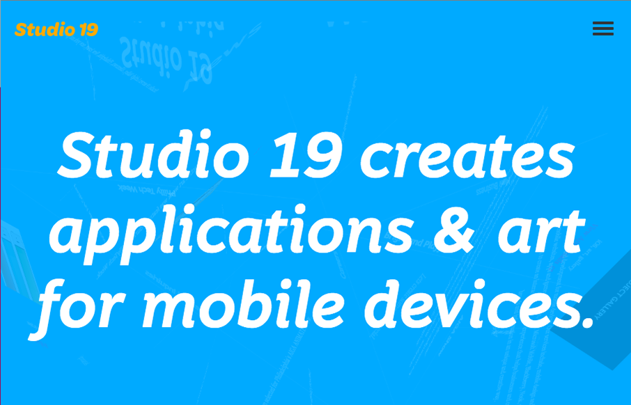
This Studio 19 website is in the gallery because of the screen to screen transitions. Pretty sweet stuff there. I’m not sure it’ll work for a lot of generalized design usage but here it’s a cool tough.
Glassmorphism: The Transparent Design Trend That Refuses to Fade
Glassmorphism brings transparency, depth, and light back into modern UI. Learn how this “frosted glass” design trend enhances hierarchy, focus, and atmosphere, plus how to implement it in CSS responsibly.


0 Comments