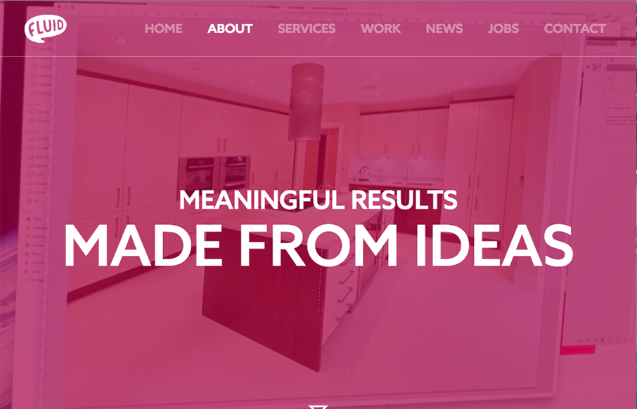
I can really appreciate the simple approach to this site design. Just big bold areas of content and imagery. I love the way the interaction on the main nav works. Graying out the nav items that you’re not mousing on. Good thinking there on the UI.
Glassmorphism: The Transparent Design Trend That Refuses to Fade
Glassmorphism brings transparency, depth, and light back into modern UI. Learn how this “frosted glass” design trend enhances hierarchy, focus, and atmosphere, plus how to implement it in CSS responsibly.


0 Comments