VR Sessions

VR Sessions

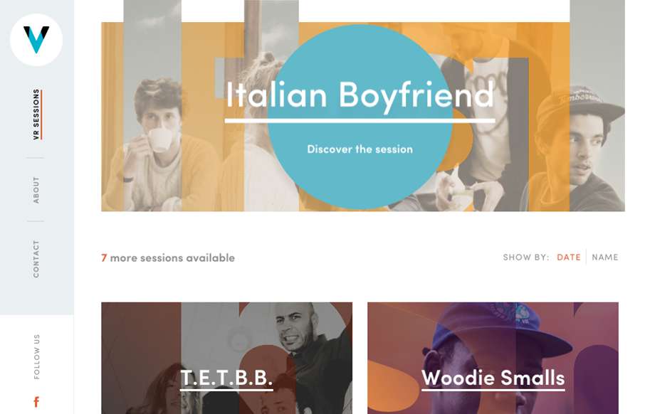
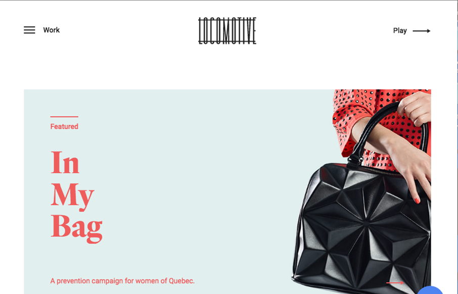
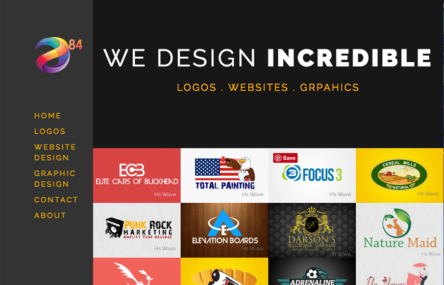
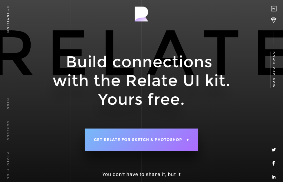
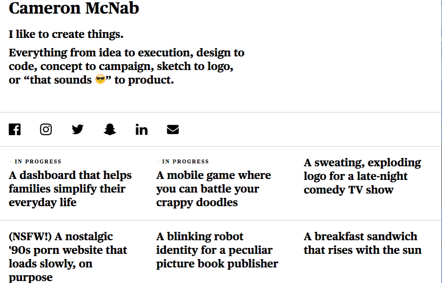
Pretty slick website design. It's largely mobile first and indeed I like the mobile to ipad screen size designs best. The "side bar" vertical navigation is unique, though I question it's usability, I'm not entirely sure it matters much for this site. Pretty cool...

Radolo

Radolo

Pretty cool site design. I dig the bold graphic approach and the muted color palette. The project planner is cool as well as the fly-out menu design. Good work. From the Designer: In the newest iteration of the Radolo website we wanted to create a clean minimalist...

Fubiz Talks

Fubiz Talks

Badass event website. I love the way they're utilizing the parallax thing with the floating image elements. Then the timed/triggered stuff is top-notch.

I Am Spent

I Am Spent

A lot of this reminds me of David Carson's work. But kind of updated. I dig it, cool vibe and neat imagery overall when it's put together.

Locomotive

Locomotive

Pretty sweet layout. Very unique too. I dig the detail work and the interactions here and there. Solid.

North Pier Brewing

North Pier Brewing

Big bold type and cool earthy colors, really fits well with the "brewing" vibe. I also love the way they've utilized the youtube video too. Cool stuff.

Nachume Miller

Nachume Miller

Beautifully simple portfolio and presentation. I love the video used for something like this too. Good stuff.

Pheonix Media Group

Pheonix Media Group

Really great timing on all the interactions and beautifully done to boot. I really love the pacing and all the detail work throughout this website. Very good work.

Rodesk

Rodesk

Damn this site is sexy. I love that navigation interaction and it's placement. I also love the way the content is stacked down the home page. Very cool vibe.

Outlines

Outlines

Pretty cool use of the main image and the simplified navigation layout. I really like the visual interest in the layout as you scroll down the page. It generally keeps you eyes pulling down to get to more content.

327

327

I love the bright yellow and the simple text used to make up this website design. I especially like the mobile view best. Really beautiful.

Gallantry

Gallantry

Pretty standard faire as far as an ecommerce layout goes. But I love the way the photography and overall simplification and coloring of the website itself is done. It all goes seamlessly together. That footer area too, nice.

Capcho

Capcho

Man, really cool interaction parts to this website for stocking caps. Very cool stuff, keeps you browsing. I love the way the images slide around as you scroll.

Heads Up Guys

Heads Up Guys

Sometimes you have to go for a clean and clear presentation of a topic and content. The Heads Up Guys website is just that, all business. Good looking work.

ArtsDesign84

ArtsDesign84

Rich looking work. I dig the simplicity of the site and elements. Straight forward and not complex content. Good looking stuff here. From the Designer: We started as a small group ( we are still small ) of designers helping business persons and normal humans to bring...

Noise Cans

Noise Cans

This site is pretty weird, but I dig it. I like the colors and the video/imagery. The submitted synopsis really says it all for me: The Charles NYC paired artistic "Low-Tech" photo and animation filters with a combination of retro and futuristic type treatments for a...

meltmedia

meltmedia

Beautiful website design for meltmedia. I love every aspect of this website. There's plenty of little detail work to keep you into it. Like the effect used on the team headshots, love that. Then there's the case studies too, beautiful look and feel here, also solid...

Peter Hol

Peter Hol

It always amazes me when I see a portfolio site like this one for Peter Hol and it's so simple and elegant and it just works. I love it. Brilliantly simple work always wins. From the Designer: HI, my name is Peter Hol I'm a Dutch graphic and interaction designer...

Diocese of El Paso

Diocese of El Paso

Big design here. I dig website projects like this one. Typically plenty of pages to get some good IA work out of it and enough design problems to solve to get all the content bubbled up to the home page. Love this design result here very much. From the Designer: We...

Rofikul Shahin

Rofikul Shahin

Really fresh looking site design. I like how things load for you the first time you scroll the site. I also like how he's just upfront about what he does. It's a niche but solid copy makes it easy to get into. From the Designer: A Front-end Developer based in...

Archon Spas

Archon Spas

Cool design submission from Drew Bradley @ARCHON_SPAS. I dig the way the design utilizes photography as design elements moreso than just images. Nice work. I wanted to submit this design because it's unusual for a day spa. Often spas and beauty salons are targeted...

Firewatch

Firewatch

Man, beautiful moment when you first scroll down the home page for the Firewatch site. It's enough to hook me into checking the game out. Okay guys, you won. I'm playing it.

Leading Design Conf

Leading Design Conf

Cool looking design and layout for Leading Design Conf. A new one from ClearLeft and @adactio. Wish I could go.

Relate

Relate

Lots of crazy detail work for the Relate site by InVision. Beautiful work for what i'm sure is a super cool app.

Aumcore

Aumcore

On the surface the layout for Aumcore has that familiar bootstrap vibe. But there's plenty of custom elements, like the form fields and the way the images are used. Solid either way. Love it. From the Designer: Aumcore is a leading NYC Digital Marketing Agency...

Adam Haworth

Adam Haworth

Website designed for a personal travel and photography blog using the CloudCanvas platform. Submitted by: @lakewoodmedia Role: Designer & Developer Country: United Kingdom

Cameron McNab

Cameron McNab

Not much to the site technically but this personal site for Cameron McNab is actually pretty cool. Minimal in it's design approach but cool in it's color shift affect. Pretty nifty idea. From the Designer: A simple take on my personal portfolio. Fully responsive,...

Creative Cruise

Creative Cruise

Really creative approach to a website layout. Very fun and interactive, but for a purpose which gives it a big thumbs up in my book.

Monday

Monday

Just a solid straight forward website design. Everything is placed just right and works like it should. It's beautiful visually and has strong color usage and branding. Just good work that deserves a second look.