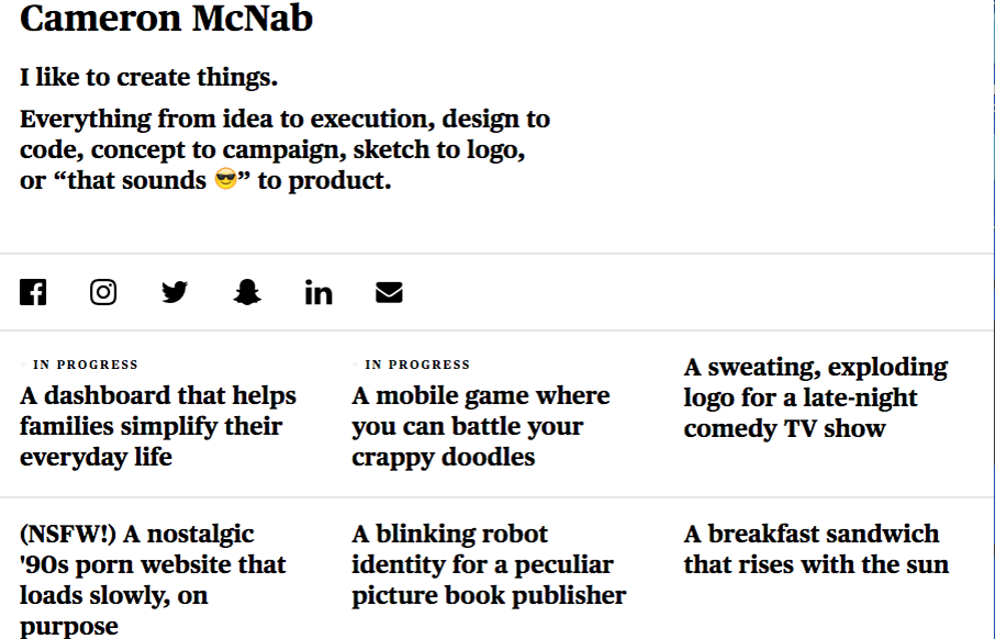
Not much to the site technically but this personal site for Cameron McNab is actually pretty cool. Minimal in it’s design approach but cool in it’s color shift affect. Pretty nifty idea.
From the Designer:
A simple take on my personal portfolio. Fully responsive, minimal typographic layout. Only two images: Snapcode and gingham SVG pattern used for one hover effect.
Submitted by: Cameron McNab
Twitter: @cameronmcnab
Role: Designer & Developer
Country: Canada


0 Comments