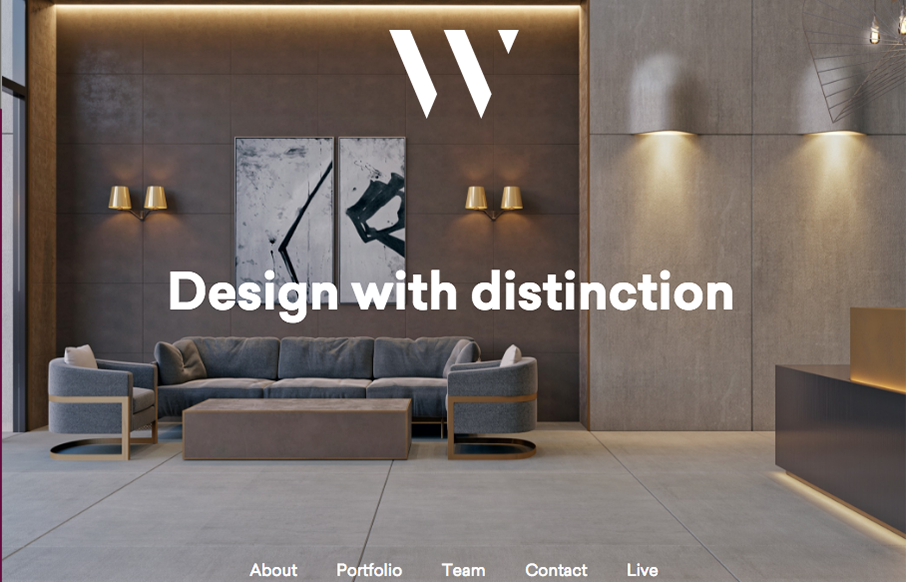
I like the 1/2 way corporate and 1/2 way trendy feel to the site for WhiteHall. Great typography and some good photography make the site shine to me.
Glassmorphism: The Transparent Design Trend That Refuses to Fade
Glassmorphism brings transparency, depth, and light back into modern UI. Learn how this “frosted glass” design trend enhances hierarchy, focus, and atmosphere, plus how to implement it in CSS responsibly.


0 Comments