by Giovanni DiFeterici | Aug 22, 2012 | Gallery
narrowdesign.com is a beautiful site. It has a wonderful mix of understated elements and bold active movement that is really exceptional. I love the gallery views of past projects. The three panel slider is impressive and bold. It makes me think of dribbble in some...
by Gene Crawford | Aug 22, 2012 | Gallery
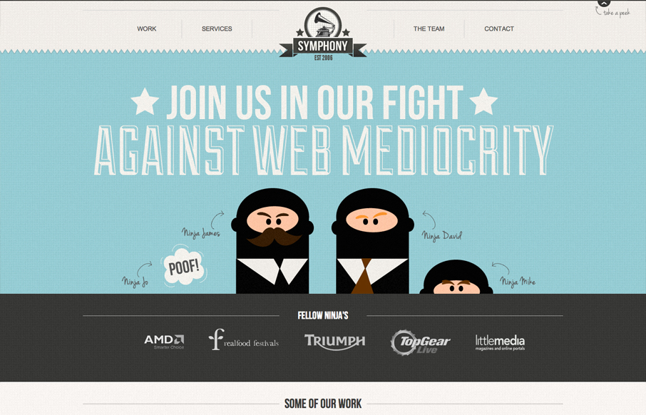
Submitted by: David Moore Role: Designer & Developer A responsive one page website design with vector web ninjas to boot! I’m not a huge fan of having to wait so long for the site to load, but overall it’s a nice visual experience. Good responsive...
by Giovanni DiFeterici | Aug 22, 2012 | Education, Gallery
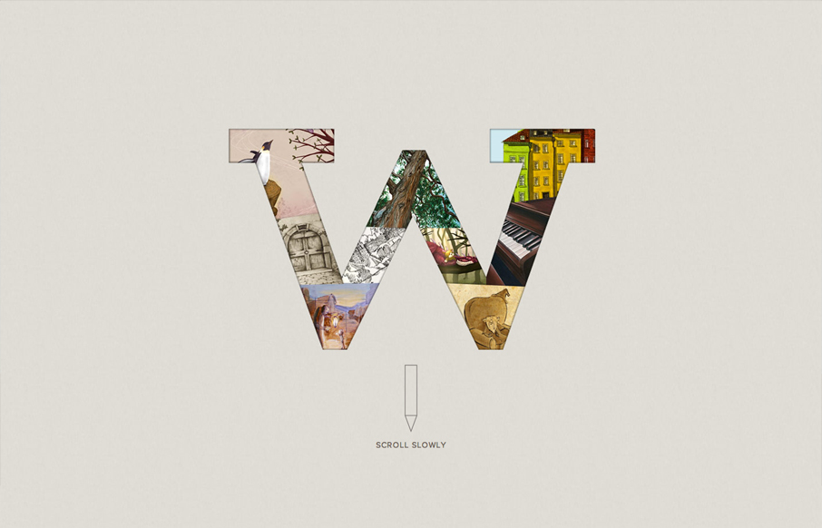
Submitted by: Scott Robertson @scottusrobus Role: Designer & Developer I dig the spare, open style of wigolia.com. It has drama and charm at the same time. the mix of art styles is a nice touch. It’s a subtle way of showing that the Wigolia team has a broad...
by Giovanni DiFeterici | Aug 21, 2012 | Gallery, Portfolio
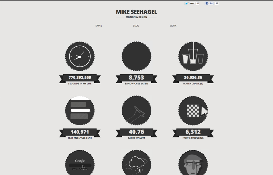
This is a great example of how .gif images can be used to liven up a static page. I won’t say that it’s not busy here, but the tone is fun and the crisp artwork looks great. A love the achromatic palette. I can’t vouch for the accuracy of the data...
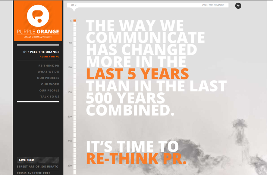
by Gene Crawford | Aug 21, 2012 | Design Firm, Gallery, Marketing Company
Submitted by: Emily Hopcian We set out to make a new and distinctive brand identity for ourselves (Purple Orange is a brand communications agency) and settled on this one-page design utilizing parallax to create a more dynamic look and feel. We tapped two agencies to...
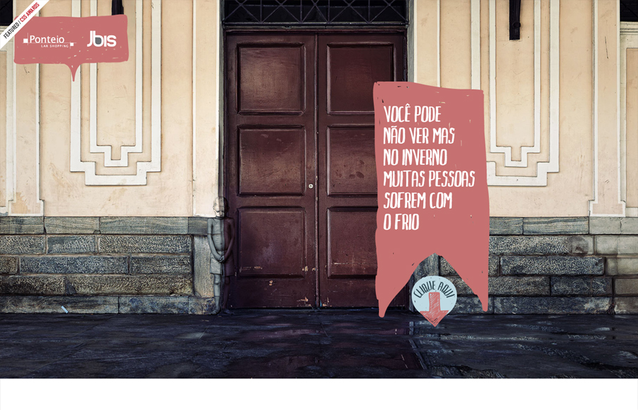
by Giovanni DiFeterici | Aug 21, 2012 | Gallery
Submitted by: Raynner Patry @raynner Role: Developer This site uses simple transitions and animations to wonderful effect and creates a narrative that is both poignant and surprising. It also has a nice mix of realism and handicraft. Nice.