by Giovanni DiFeterici | Aug 24, 2012 | Education, Gallery
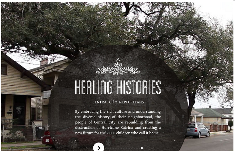
Submitted by: healinghistories.org The W.K. Kellogg Foundation recently launched a new interactive documentary project called Healing Histories. This innovative effort showcases authentic stories about communities across the country working to heal racial divides and...
by Giovanni DiFeterici | Aug 24, 2012 | Gallery
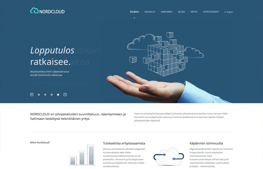
Submitted by: Samuli Nivala @buena_fi Role: Designer & Developer Nordcloud is a perfect example clean, sensible web design. It’s certainly not the flashiest site that I’ve reviewed, but it is tastefully simple and extremely usable. I would like to see...
by Gene Crawford | Aug 24, 2012 | Gallery
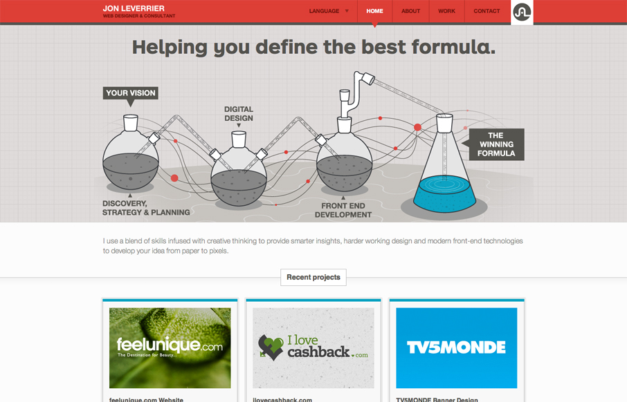
Fun looking design that’s very business oriented at the same time. The main illustration is nice and the small interactions on it give me a certain level of enjoyment to check out. While the overall tone is clear and focused and get’s to the point there is...
by Giovanni DiFeterici | Aug 23, 2012 | Gallery, Marketing Company
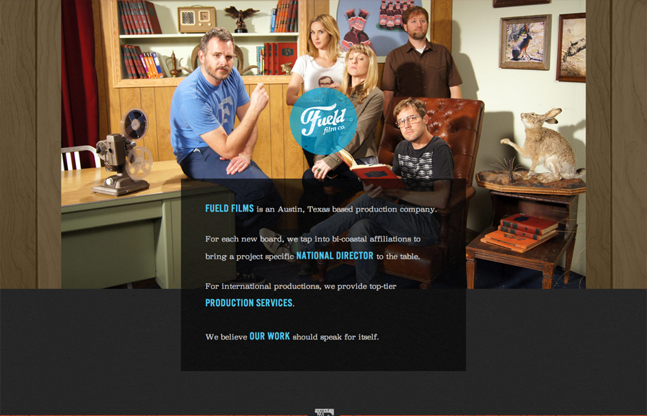
Submitted by: David Guillory @builtbysource Role: Designer & Developer Fueled films has an amazingly bright feel for such a dark design. I like the theatrical photography and understated humor. I can tell that these people are in the business of entertainment....
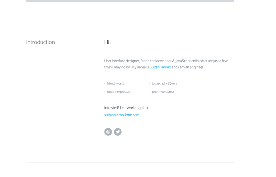
by Gene Crawford | Aug 23, 2012 | Gallery
Submitted by: Sultan Tarimo @Tbakdesigns Role: Designer & Developer We don’t normally post something this minimal here in the gallery but this one is just so nice. It feels very architectural to me, in a truly minimal sense though. I love the slight...
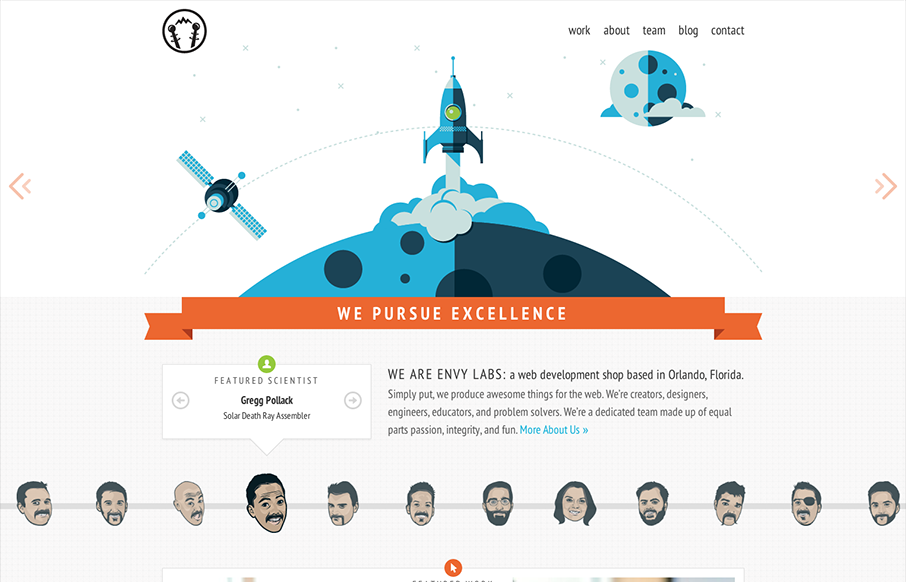
by Giovanni DiFeterici | Aug 23, 2012 | Gallery
This is a damn fine site. I love the mix of quirky art and straight forward language. The design is rock solid with just enough sizzle that you know the team has a sense of humor. It rides the line between completely professional and a little zany, which is perfect...