by Gene Crawford | Sep 21, 2012 | Gallery
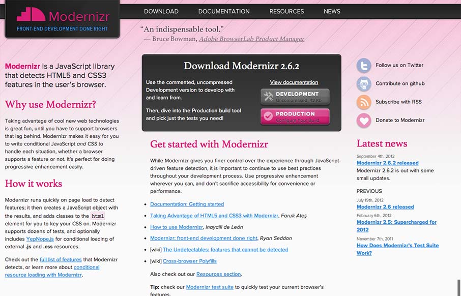
I gave Modernizr․com a small facelift: faster, less finicky, clearer intro text. Enjoy! modernizr.com— Faruk Ateş (@KuraFire) July 20, 2012 Been meaning to put the Modernizr site in the gallery for a while now. Faruk does a great job keeping the site alive...
by Gene Crawford | Sep 20, 2012 | Design Firm, Gallery
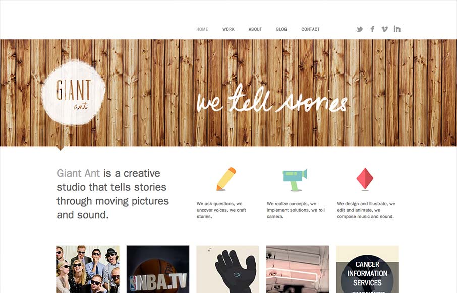
Nice simple and effective website design, it does what it needs to do and packs it in with a clear yet dense layout. I like the way these guys are selling themselves as a “storytelling” agency, that’s a fun and compelling message to me. Love the wood...
by Gene Crawford | Sep 20, 2012 | Food and Beverage, Gallery
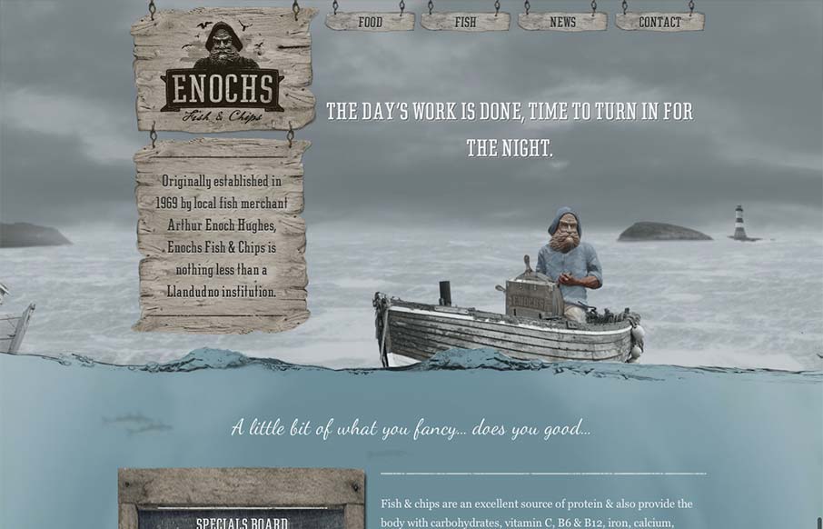
An unexpected responsive design here. It’s one of a few sites i’ve seen recently that takes a lot of the same RWD patterns and adds a layer of decoration on top of it (with the ship captain/fisherman theme) and pulls it off really well. I love the hook...

by Gene Crawford | Sep 20, 2012 | Gallery
I like this website because it’s not overly fancy. It has a strong graphic punch and some neat visuals that have been clearly crafted by hand, like the timeline section. It’s a nice example of a website doing what it needs to do for you.
by Gene Crawford | Sep 19, 2012 | Gallery, Portfolio
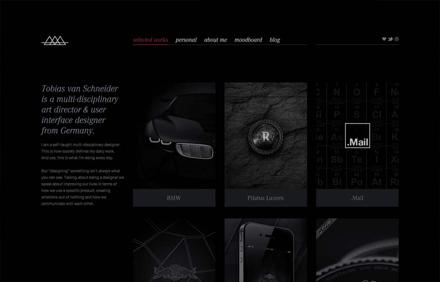
I like the moody darkness of this website. The interaction of the X that loads over the work samples is nice and has a good feel to it as you mouse around. The mood board is a clever look into who this designer is and the blog is a superb minimal example IMHO. Love...
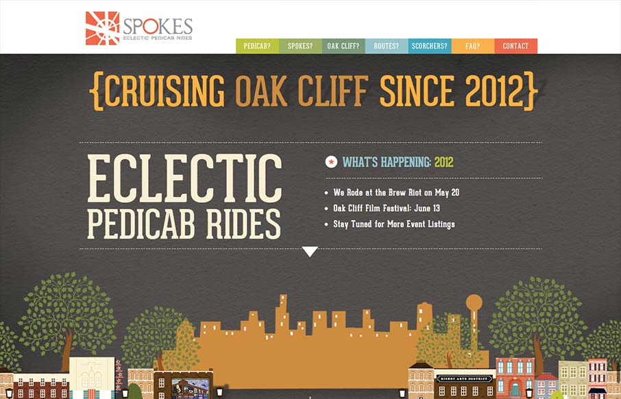
by Gene Crawford | Sep 19, 2012 | Gallery
Just a fantastic way to share the narrative of what a ‘pedi cab’ is and how it all works. Beautiful illustrations and scrolling based animations, just wonderful to look at.
