by Gene Crawford | Jun 19, 2012 | Education, Gallery
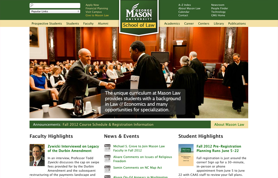
University websites are a great place to study how large sprawling organizations with tons of content handle things. In this case the change in navigation design is largely from the wide horizontal nav structure with drop-down sub elements to the iPhone screen sized...

by Gene Crawford | May 22, 2012 | Education, Gallery
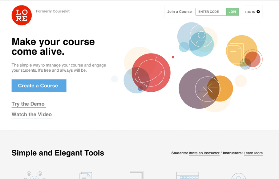
Lore previously known as coursekit (this subsite is a beautiful experience in it’s own right – check it.) is a simple looking layout, but is very well balanced and packs a punch impact wise. It’s both subtle and complex at the same time wich just...

by Gene Crawford | May 9, 2012 | Education, Gallery
Awesome concept and beautiful execution of this website. The responsive design details are nice and worth a study. I particularly like the fixed header and the “contact” link interaction. The signup page is also very nicely done. A super clean and minimal...
by Gene Crawford | Mar 8, 2012 | Education, Gallery
The new University of Notre Dame website is already a classic. The responsive approach and superb details make this worth every second of your scrutiny and study. I found this via this great interview about nd.edu here. I really like this answer to why the team chose...
by Gene Crawford | Dec 1, 2011 | Education, Gallery
Beautifully done relaunch of Carsonified’s treehouse (was membership.thinkvitamin.com). The design is really clean and clear and doesn’t get in the way for users, but has plenty of depth with the icons/badges that should give you plenty of eye candy to...
by Giovanni DiFeterici | Nov 18, 2011 | Education, Gallery
englishworkshop.eu is a sweet and simple design by Simple as Milk for the English Workshop. Its a site that paints in broad strokes, the text is big and the content areas as are the color separations. I wonder about hiding the bulk of the content behind artwork (the...
