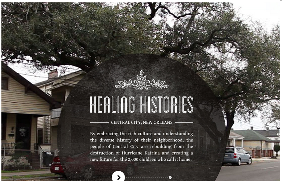
by Giovanni DiFeterici | Aug 24, 2012 | Education, Gallery
Submitted by: healinghistories.org The W.K. Kellogg Foundation recently launched a new interactive documentary project called Healing Histories. This innovative effort showcases authentic stories about communities across the country working to heal racial divides and...
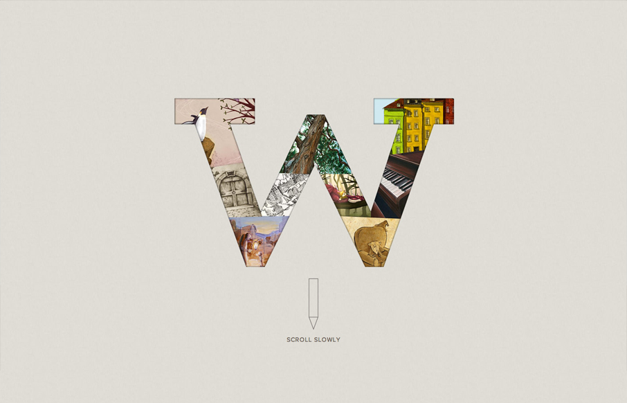
by Giovanni DiFeterici | Aug 22, 2012 | Education, Gallery
Submitted by: Scott Robertson @scottusrobus Role: Designer & Developer I dig the spare, open style of wigolia.com. It has drama and charm at the same time. the mix of art styles is a nice touch. It’s a subtle way of showing that the Wigolia team has a broad...
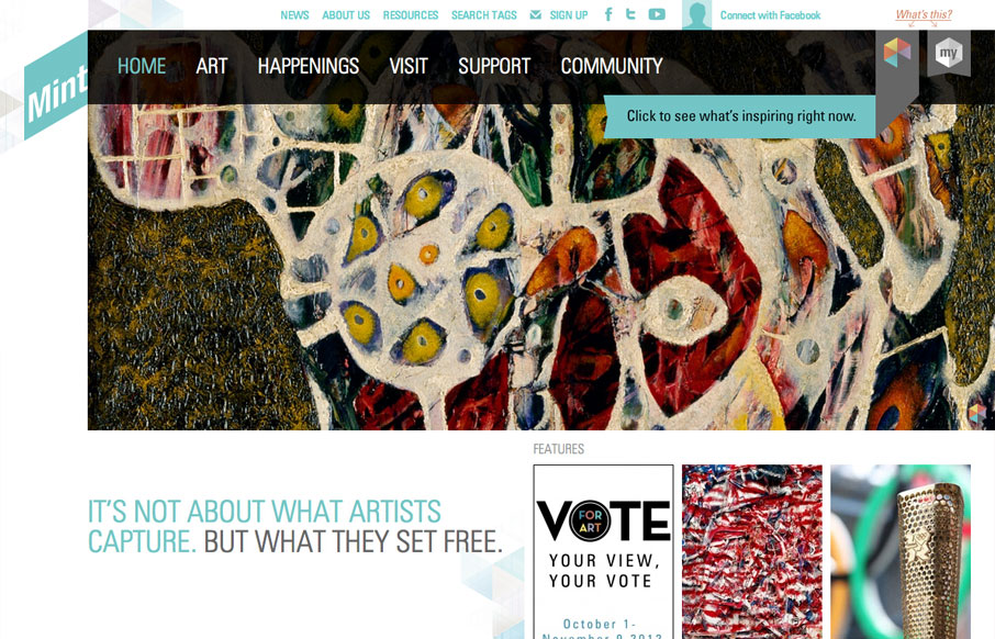
by Gene Crawford | Aug 9, 2012 | Education, Entertainment, Gallery
The way they’ve used the logo in the mint museum website is pretty clever it’s off the side and sort of slanted and it’s not the central element but yet it’s very noticeable. The large hero image slideshow is pretty standard but they’ve...

by Gene Crawford | Aug 8, 2012 | Education, Gallery
The Winforever website has that corporate/sport look, which is perfectly fitting. I really like the interactions over the three blog post blocks. Having them slide up and over the image is unexpected and adds just a nice extra little level of interaction to this clean...
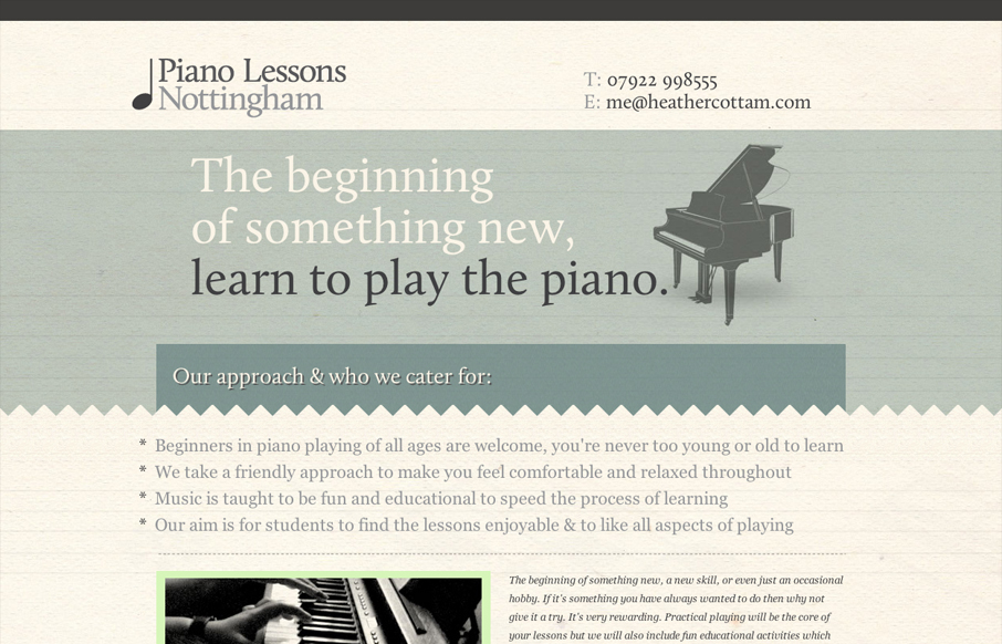
by Gene Crawford | Jul 26, 2012 | Education, Gallery, Music
Very smart single page website design. Nice responsive solution too. I like the monochromatic/underplayed colors too, it sets the tone for a nice laid back expectation from these lessons.
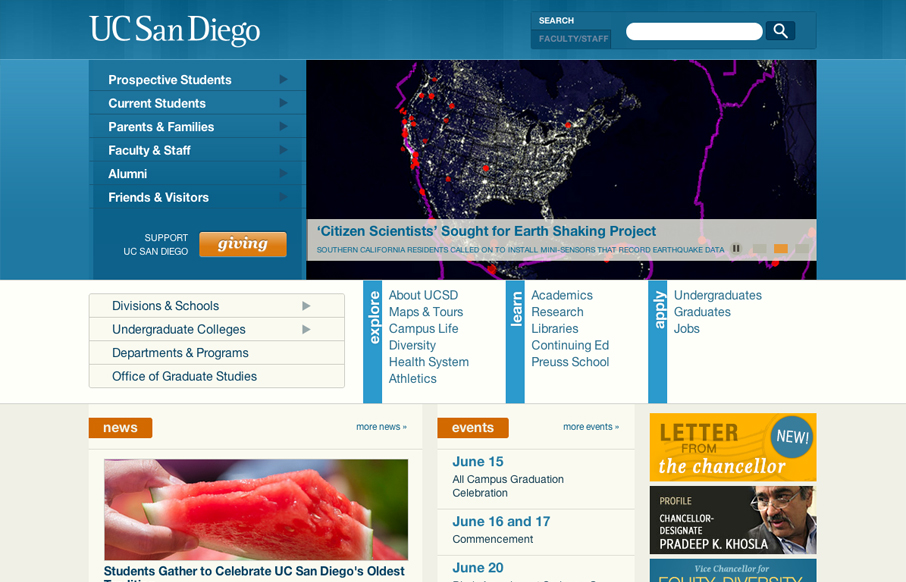
by Gene Crawford | Jun 20, 2012 | Education, Gallery
The UC San Diego website is very modular and square which is softened up a bit by the colors and a few slightly rounded corners here and there. There are a few sections of the home page that fall into a sort of “i’m just tired of designing” sort of...