
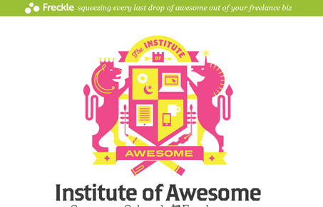
Way super simple design and execution for the Institute of Awesome. I wanted you to see this design mainly for the illustration and copy. There are also some rather subtle things going on as you make your way down the page that are just super nice. I really enjoyed this site and it’s content. Keep up the Awesome Freckle folks!




0 Comments