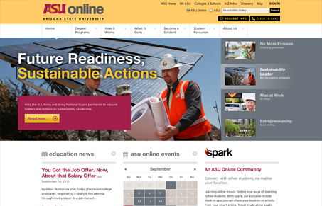
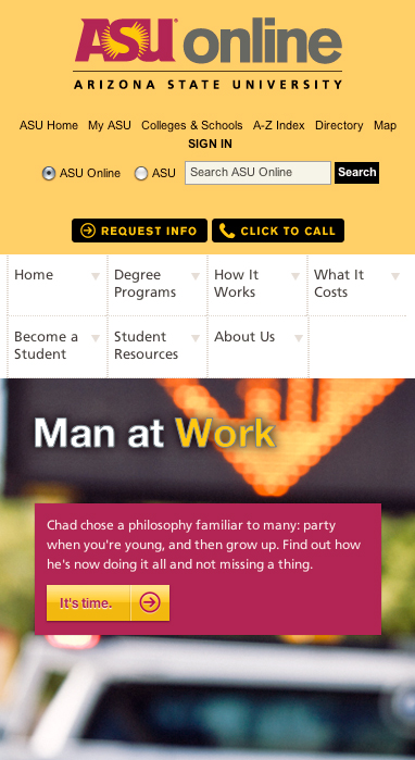
.edu sites are challenged with needing to have a variety of info – and a lot of it. They’ve got to communicate to and direct current students as well as prospective students, and in some cases parents. Most likely, that’s the reason they’re usually horribly designed. You won’t find that to be the case here. The ASU Online site has no shortage of content, yet its layout is clean and its eyepath is clear. Although the branding of the site remains consistent with ASU, it seems to have its own distinction and reads less like a school site and more like an engaging, informative hub. I appreciate the breathing room and varied type sizes used to make it easy to read through. The call-to-action buttons stand out nicely and the nav is straightforward. All small details that, when used together well, make a potentially overwhelming type of site just plain work.


0 Comments