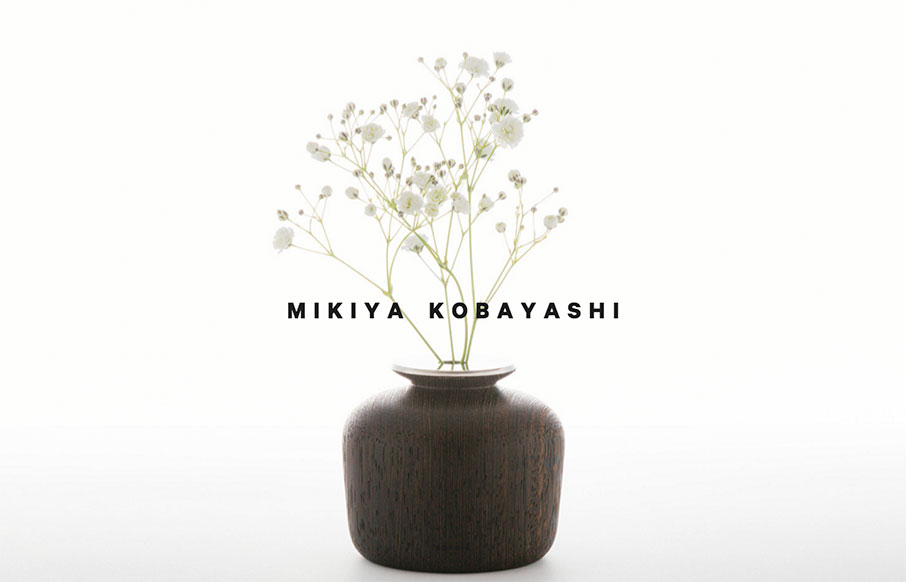
by Aaron Griswold | Feb 9, 2016 | Gallery
Love the movement and design of this site for Mikiya Kobayashi out of Tokyo. Kobayashi’s design work is beautiful, and the site really shows all of it off well. I don’t always like the double off-screen / hamburger nav, but they only use it for the...
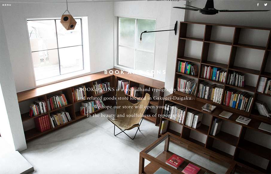
by Gene Crawford | Sep 4, 2015 | Gallery
Pretty tidy layout for Book & Sons. I dig the large imagery and the simple nature of the grid at work here. I’m not too happy with the big background images and the white text overlaid on them, sometimes the copy is impossible to read. Fixing that up would...
by John David Hunt | Jun 23, 2015 | Gallery, Product
I love the straightforward minimal approach of this site, coupled with it’s easy to use interface for filtering by product type and color it brings me closer to the product than most other product pages I visit. The grids of colorful rows are just magical in...

by Aaron Griswold | Apr 22, 2015 | Gallery, Marketing Company
Ok – turn your sound down or click it off on the top left when you get to Paquebot – but the ditty works for this agency site out of Tokyo because it fits well with the time-lapse video. And the time-lapse video makes this one-pager “sing”...
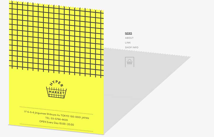
by Aaron Griswold | Jan 8, 2015 | Gallery, Shopping
Ok – it took me a minute to see what Hyper Market’s website was doing here. Scroll all the way down, and you see the gray on the right is a shadow of the yellow that’s scrolling up the screen – which is a cool effect. To accomplish that, it...