Paquebot inc

http://paquebot.jp/

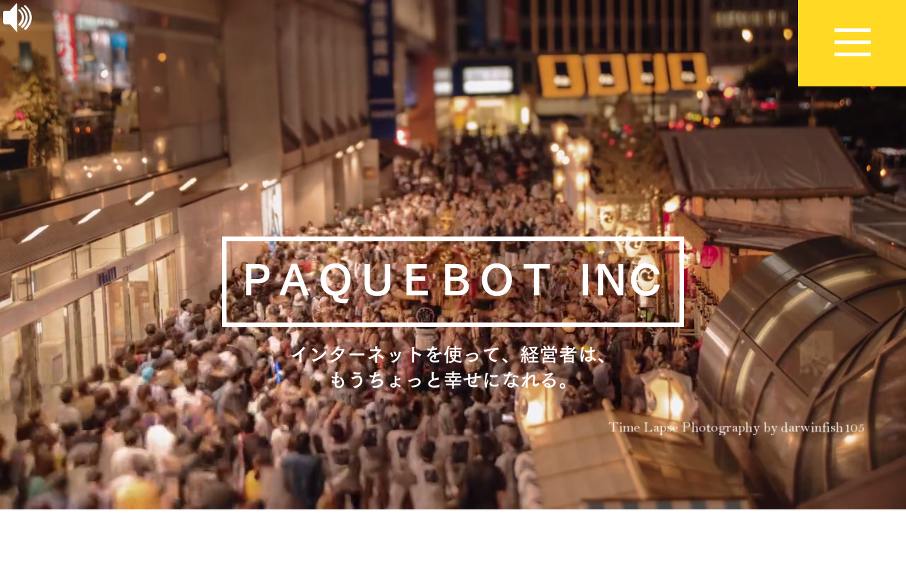
Ok – turn your sound down or click it off on the top left when you get to Paquebot – but the ditty works for this agency site out of Tokyo because it fits well with the time-lapse video. And the time-lapse video makes this one-pager “sing” – love the way it feels like it isn’t exactly real. The rest of the site is simple and to the point – but I think you’ve already been grabbed by the intro – so you’re probably good to go. Only suggestion would be to make any of the hiragana / katakan / kanji be type, instead of a background image – my Nihongo is very rusty, so I use Google to translate.


PAQUEBOT


From the Designer: japanese creative agency

Submitted by: Tasuku Kobayashi
Twitter:
Role:
Designer


0 Comments

Submit a Comment

Your email address will not be published. Required fields are marked *

News & Articles

Sign-Up: Enhancing Conversions through good UX

Sign-Up: Enhancing Conversions through good UX

Optimize your website’s sign-up process by focusing on clarity, ease, and user mindset. Clearly explain the purpose, benefits, and steps, and use social proof to build trust and drive conversions.

The Essential Guide to Getting Started on Freelance Writing

The Essential Guide to Getting Started on Freelance Writing

Explore the lucrative and fulfilling world of freelance writing with our essential guide. Learn about specialties like blogging, social media, article, and technical writing. Build a portfolio, find work, set up your business, and discover the potential earnings. Embrace the freedom of working from home and follow tips for success in your dream career.