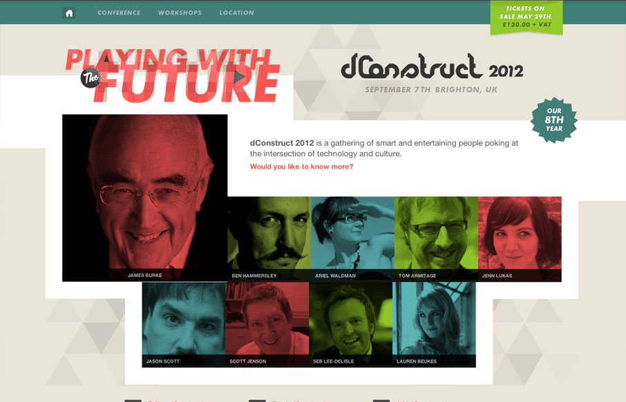
by Gene Crawford | Apr 23, 2012 | Conference, Gallery
We are proud to unveil this year’s @dConstruct site: 2012.dconstruct.org See you in September!— Clearleft (@clearleft) April 23, 2012 The dConstruct conference is definitely a high-point on the web design community’s conference calendar, and their...
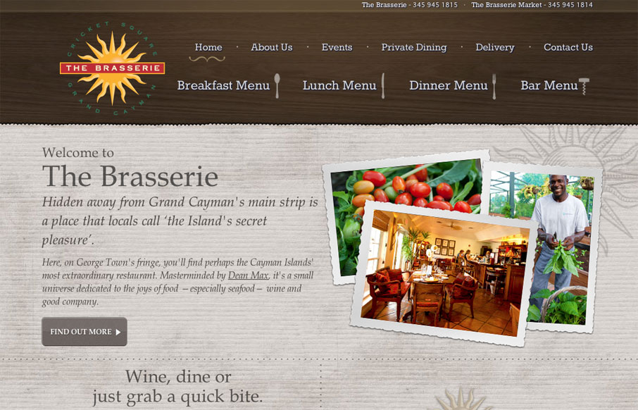
by Maria | Apr 23, 2012 | Food and Beverage, Gallery
Visually, there is some good stuff going on here. The main texture is nice and color is used well to help frame out the site. The photos stand apart from the background and add a lot of vibrance to the page. Small touches of hand-drawn elements keep things feeling a...
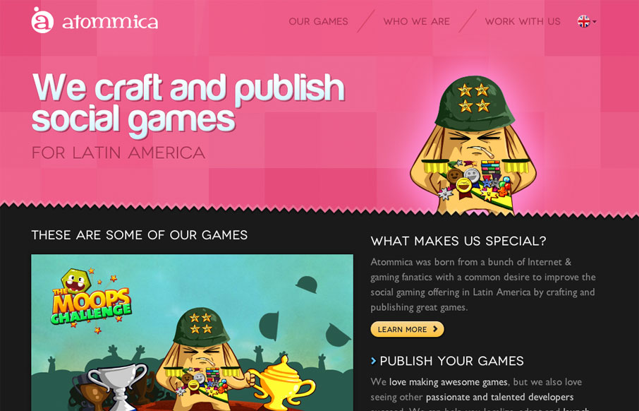
by Gene Crawford | Apr 17, 2012 | Gallery
Pretty tight design that allows itself to feel lose at the same time. The illustrations are what helps it achieve that. Simple mouse over animations here and there keep it interesting. Follow all that up with a nice responsive layout and you have yourself a damn fine...
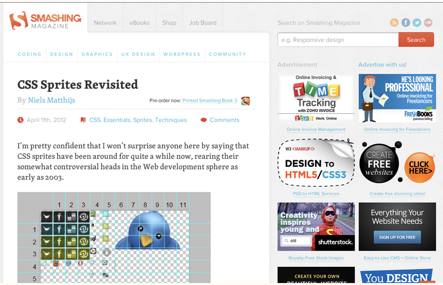
by Gene Crawford | Apr 13, 2012 | Blog, Gallery
Smashing Magazine is one of those industry staple websites right? Like Facebook, you mess with it people either love it or hate it. Giovanni and I explore the responsive design decisions in some detail (kinda) in our screen cast review. Overall we do really dig the...
by Gene Crawford | Apr 11, 2012 | Gallery, Screencast Review
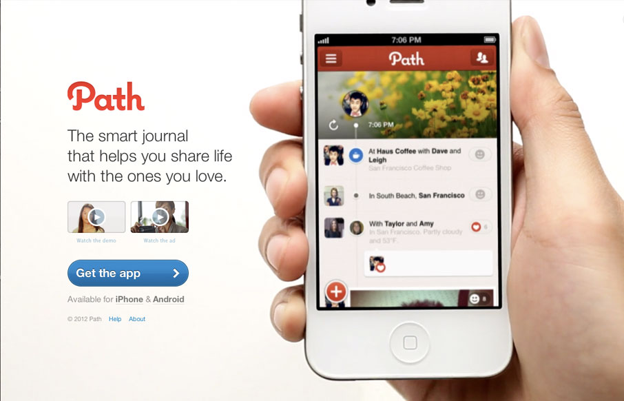
The path.com website is a simple/minimal thing of beauty. The background of the site is a demo video that auto-plays in a very unobtrusive way. It’s brilliant really, showing off the app like that – since that’s what will make you fall in love with...