We are proud to unveil this year’s @dConstruct site: 2012.dconstruct.org See you in September!
— Clearleft (@clearleft) April 23, 2012
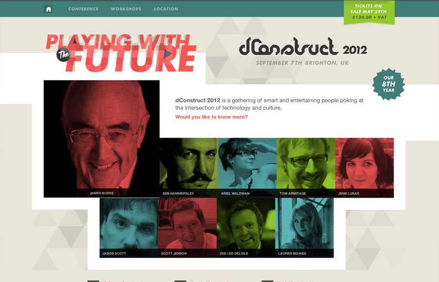
The dConstruct conference is definitely a high-point on the web design community’s conference calendar, and their new website is an excellent example as to why. I’m really digging the use of complementary colors; the reds and greens give the largely static site a sense of energy. The color overlays and artistically repeated images also contribute to that effect. And the subtle triangle pattern in the background that plays off the folded paper motif from the dConstruct logo is another nice touch.
And did I mention it was responsive? Because it is, and its pretty awesome. At any browser width or screen resolution, this site is going to look great. I tip my hat to you, Clearleft, on a website well done.


0 Comments