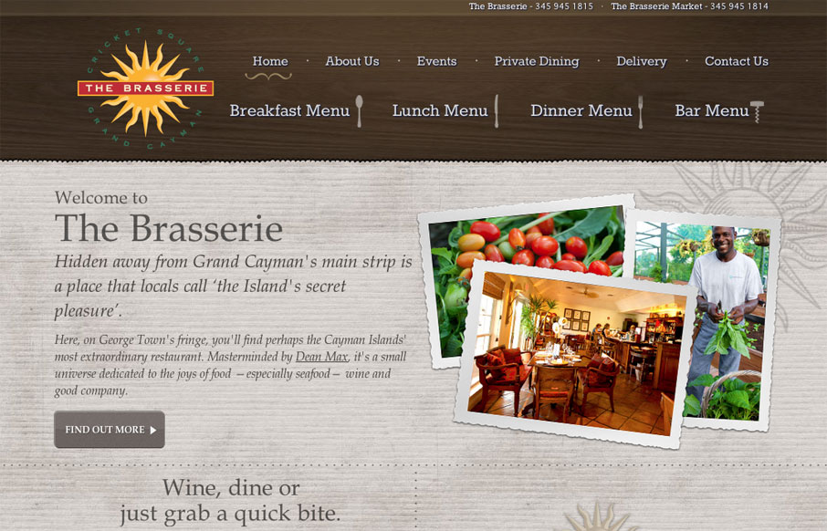
Visually, there is some good stuff going on here. The main texture is nice and color is used well to help frame out the site. The photos stand apart from the background and add a lot of vibrance to the page. Small touches of hand-drawn elements keep things feeling a bit more natural. The typography seems a little disjointed though. The italicized serif font is overused and makes things harder to read. I like how they’ve handled the menus and it’s a nice touch that they have a downloadable PDF clearly marked for each section if you need it.


The Call to Action, Revisited
The Call to Action hasn’t changed in a decade, but the bar has. A fresh look at prominence, copy, mobile tap targets, and accessibility, with lessons from three major design systems.


0 Comments