
by Gene Crawford | Apr 11, 2012 | Gallery, Screencast Review
The path.com website is a simple/minimal thing of beauty. The background of the site is a demo video that auto-plays in a very unobtrusive way. It’s brilliant really, showing off the app like that – since that’s what will make you fall in love with...
by Gene Crawford | Apr 10, 2012 | Gallery, Screencast Review
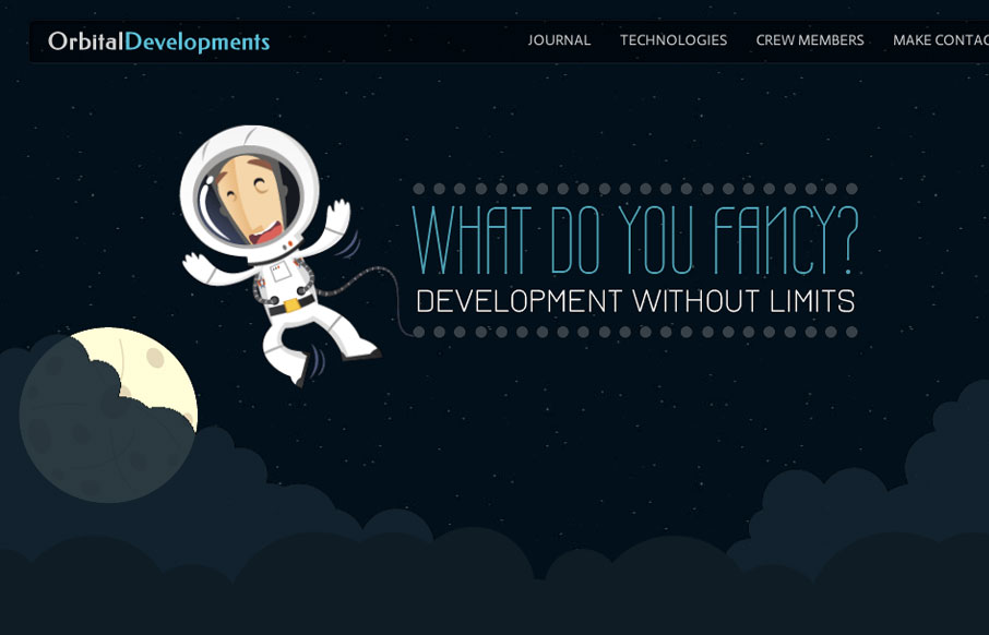
Love the Orbital Developments site design. It’s fun and functional. I really dig the responsive approach and some of the finer details. Like the moon and slight astronaut animation. Gio and I dig in with our screen cast review, give it a watch and tell us what...
by Gene Crawford | Apr 9, 2012 | Entertainment, Gallery
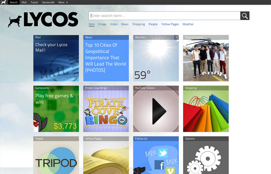
The new Lycos website is interesting. It’s primary use is the deliver the search field and also has a large grid of selections for different stuff you can do. Like news feeds and video feeds, etc… I like that it’s responsive a lot, honestly...
by Gene Crawford | Apr 5, 2012 | Gallery
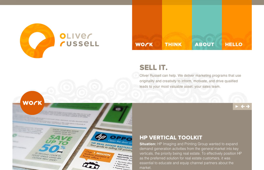
I like the two main column layout for this website. The use of the circles and overall blocky feeling of the design makes for a nice contrast, especially with the circular swirly pattern behind the main elements. The responsive design for this site is pretty well...
by Gene Crawford | Mar 28, 2012 | Gallery
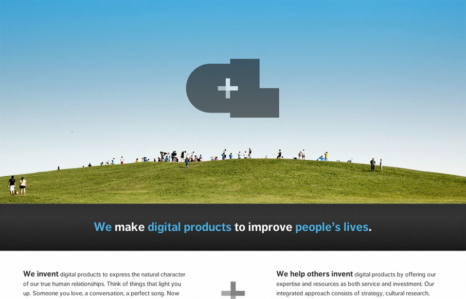
The new Crush Lovely website is simple and direct. I really dig how the tone is mainly delivered with copy and such. The “select clients” and “imagined future clients” stuff is pretty smart. The super large contact form with the large text box...
