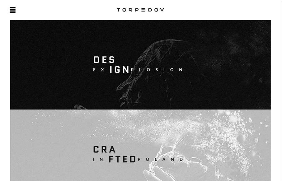
by Gene Crawford | Sep 10, 2015 | Gallery, Portfolio
Pretty solid graphics on the home page, I dig that left or right choice. I also like how he’s used the hamburger menu thing in the logo look as well. It helps tie it together for people. Nice use of slight animations in the case study imagery as well. From the...

by Aaron Griswold | Aug 25, 2015 | Gallery, Marketing, Marketing Company
Great clean site from emota out of San Diego (made by Bumbli also out of San Diego). They do video – and it’s pretty powerful stuff. Good use of actual client work for the video background to draw you into the site, and good use of it in the case studies...
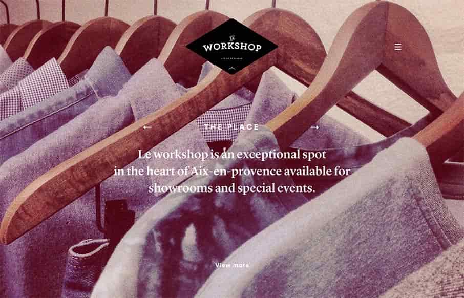
by Gene Crawford | Aug 24, 2015 | Gallery
It’s not often you see a website that really matches the physical location that it’s representing quite like this site does. Based on the pictures I really feel like the vibe of the space and the vibe of the website design and layout matches fairly...
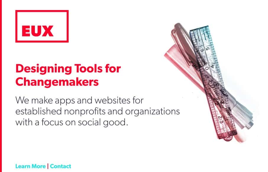
by Gene Crawford | Aug 20, 2015 | Gallery
I love simple and to the point layouts like these. I also believe that this site probably “speaks” to clients about as good as one could. Check out they way they display and write about the work, very smart.
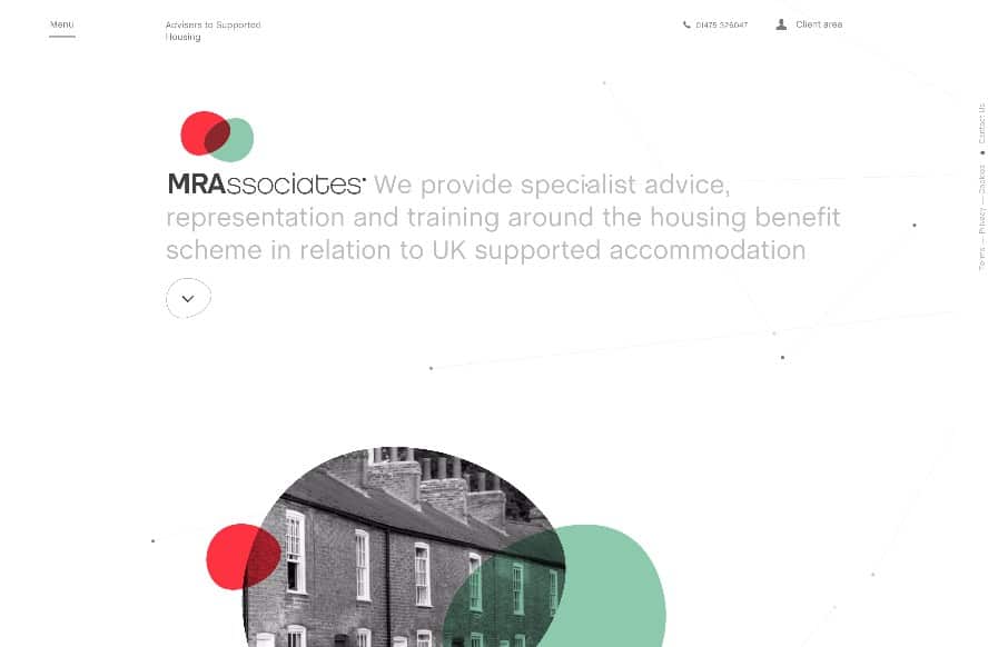
by Gene Crawford | Aug 20, 2015 | Gallery, Real Estate
I love the play between the symmetrical and asymmetrical elements to this layout. It’s full of little visual widgets and things to draw your eye around the page. I also really dig the menu design, having it open like it does really felt unique and memorable to...