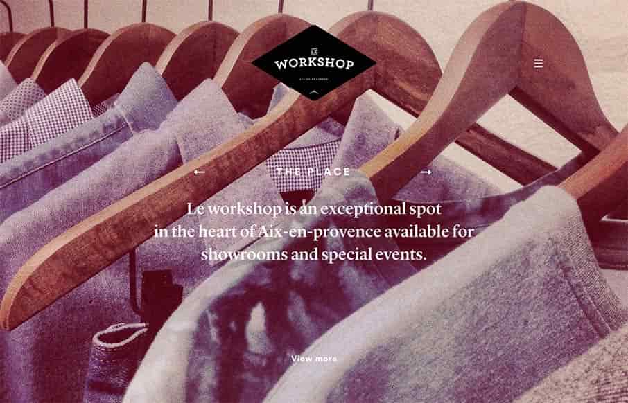
It’s not often you see a website that really matches the physical location that it’s representing quite like this site does. Based on the pictures I really feel like the vibe of the space and the vibe of the website design and layout matches fairly asynchronously. That’s never easy to pull off.
Glassmorphism: The Transparent Design Trend That Refuses to Fade
Glassmorphism brings transparency, depth, and light back into modern UI. Learn how this “frosted glass” design trend enhances hierarchy, focus, and atmosphere, plus how to implement it in CSS responsibly.


0 Comments