Torpedov

http://torpedov.com/

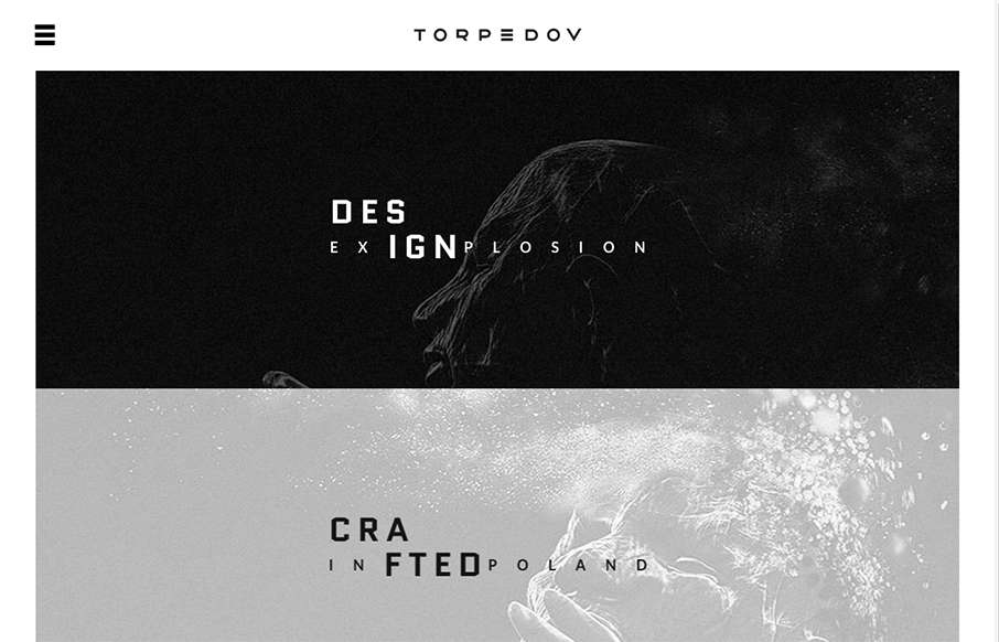
Pretty solid graphics on the home page, I dig that left or right choice. I also like how he’s used the hamburger menu thing in the logo look as well. It helps tie it together for people. Nice use of slight animations in the case study imagery as well.

From the Designer: Design Explosion – Crafted in Poland.
Submitted by: Piotr Swierkowski
Role: Designer
Country: Poland

0 Comments

Submit a Comment

Your email address will not be published. Required fields are marked *

Time limit exceeded. Please complete the captcha once again.

News & Articles

Website Scanning Patterns for Maximum Engagement

Website Scanning Patterns for Maximum Engagement

Discover how users visually process websites, the role of scanning patterns, content placement, and “the fold” Learn to design engaging pages with fast-to-consume content that aligns with user behavior.