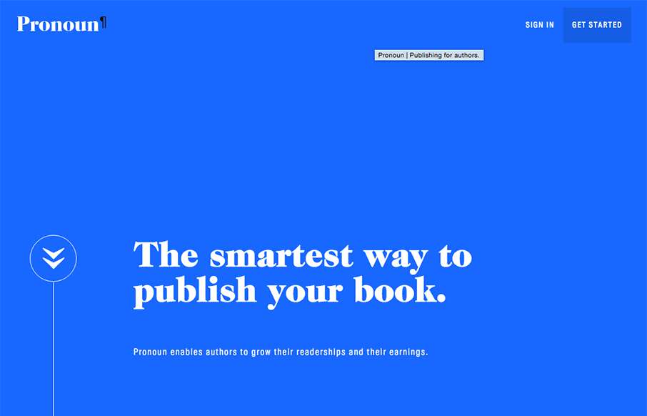
by Gene Crawford | Nov 16, 2015 | Gallery
Beautiful website. I luuuurve the big type based sections and the strong/bold colors. The way you scroll mostly acts like a slideshow, which works in this instance. Then the big reveal of the logo at the bottom is killer.
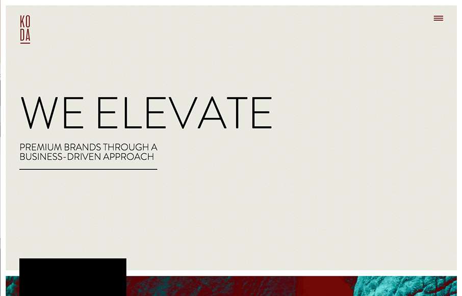
by Gene Crawford | Nov 12, 2015 | Gallery, Marketing Company
I love the “vibe” of this website. The way the main section changes across screens is smart and subtle. I also love the way they used the fixed background image as you scroll to keep a nice rhythm going for you. The play between muted and strong colors...
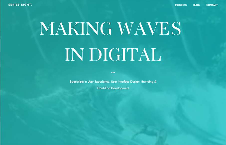
by Gene Crawford | Nov 11, 2015 | Gallery
I love the linework and colors used in this design. There is a lot of really interesting interactive details and small animations like the process section that help make this site memorable. They also show plenty of work in the projects section and they show them in...
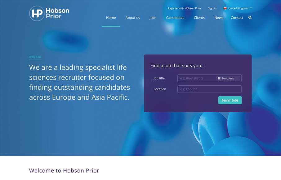
by Gene Crawford | Nov 10, 2015 | Gallery
I really dig the way the jobs search box is designed for this site. It’s first and foremost to the user and is simple and easy to understand before you even use it. Cool. I also like the responsive take on the design when you scale down to mobile screens as...
by Gene Crawford | Nov 9, 2015 | Gallery, Product
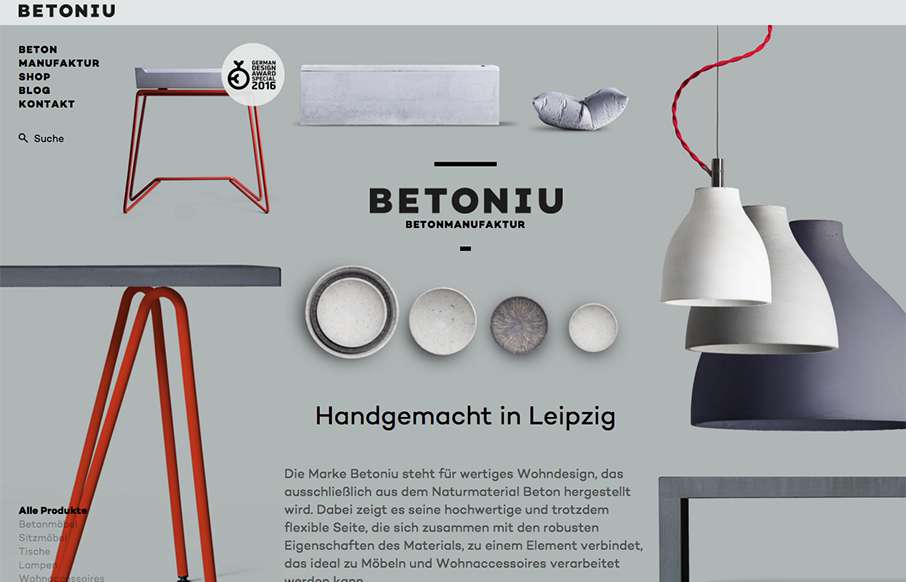
Really cool asymmetrical approach to this design. Largely the images of the products lend to making this page feel vibrant and unique. This same vibe carries through to the sub pages too. Really good looking stuff. Submitted by: Marcus Blättermann Twitter:...