by Gene Crawford | Oct 3, 2012 | Gallery
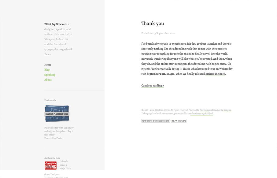
Minimal design approach on Elliot Jay Stocks website redesign. I like the intellectual approach to keeping the design focused around the content. In his post on the redesign Elliot says: When we focus on measure, we are of course focussing on the pleasure of the...
by Gene Crawford | Sep 27, 2012 | Gallery
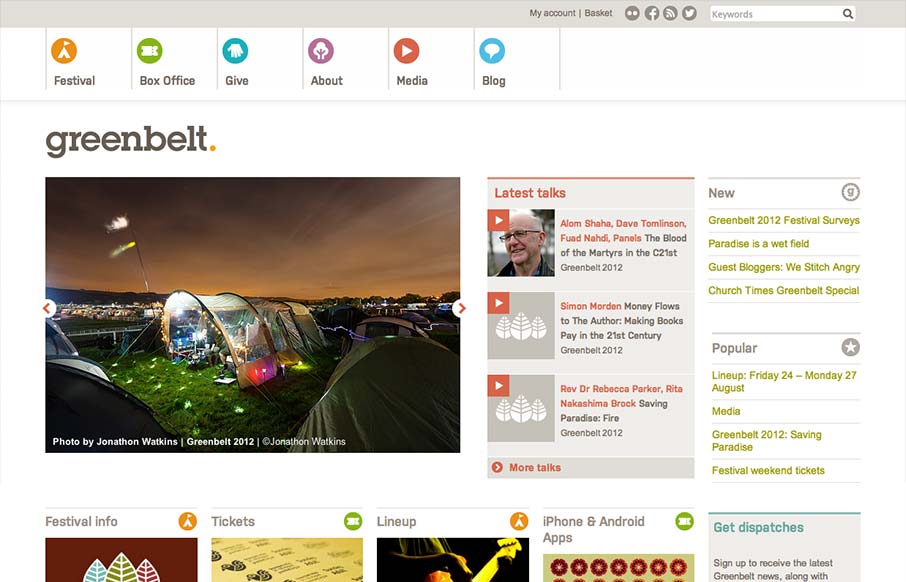
Nice responsive work here. I like the changes in the main hero/slide show area and the column work in the image blocks under it. I also really dig the menu icon/link that shows up in place of the main nav, they keep the icons near those nav links which is really...
by Gene Crawford | Sep 26, 2012 | Gallery
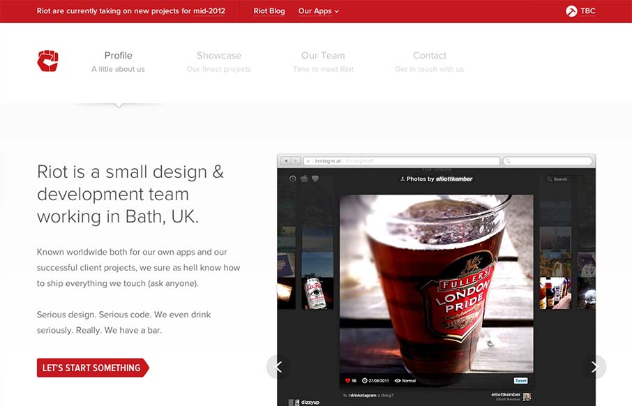
Very nice clean looking design. I love how the “out apps” is used to slide down from the topmost header area. It’s a tight design all the way through too. Great looking work.

by Gene Crawford | Sep 26, 2012 | Gallery
Submitted by: Lauri Liimatta @laurilii Role: Designer & Developer My new redesigned portfolio. Responsive design and powered by Kirby CMS. I like the design approach of going light to dark from top to bottom, or light to dense visually. However you want to look...
by Gene Crawford | Sep 25, 2012 | Gallery, Gaming
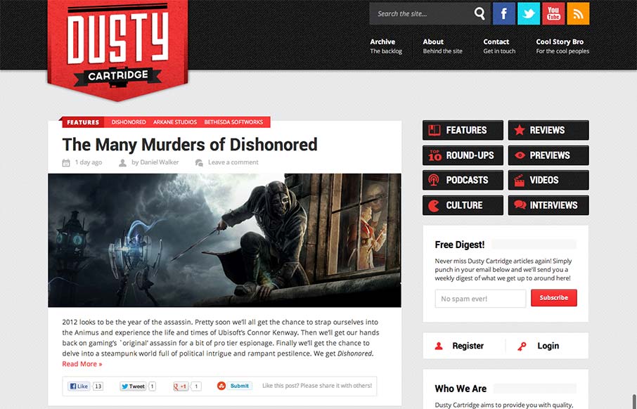
I like the blocky type design of this blog. It looks like it may be a theme but that doesn’t take away from it being a nice design. The logo is bold and the nav matches it in simplicity visually. Nice responsive layout too.
