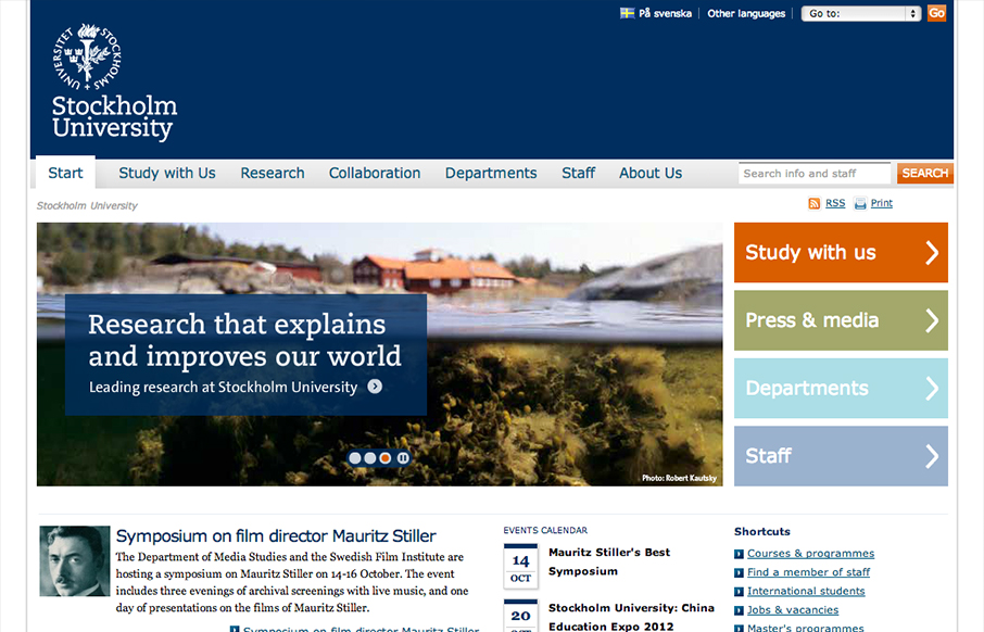
Looks like @stockholm_uni just went responsive! su.se/english/ /via @jan_lof(Some nice adaptation patterns in there, by the way.)
— Responsive Design (@RWD) October 8, 2012
Really dig into the main “hero” area and main navigation and look at the screen size changes that they’ve designed in. The changes regarding the site search are very interesting. Going from displaying the search form field to just an active button/link to a search page is something I like. They keep a lot of the interaction in place from the wide to mobile sizes too, some of it loses me but some of it is very nicely done.


I think this was a very bad example, responsive yes, functional yes, but not very inspired. You’ve also tagged it as @fontface, Verdana, Georgia and Courier are the only fonts in the CSS and all other instances of the Slab serif as in the banners are all images. I mean look at the buttons, single gradient images, no border and not even a cursor:pointer;.
I’m not saying it’s bad but not worthy of a mention on UMS in my opinion. But yeah, I guess it is responsive…
Dang, fixed the @font-face tag, not sure how that slipped on there.
I’d disagree on it not being worthy, clearly, that’s why I put it in the gallery. Like I wrote and like Ethan says I liked looking at the adaptive changes in the search, navigation and slideshow areas most. I think you can find inspiration in more than just the look and feel of a website too.