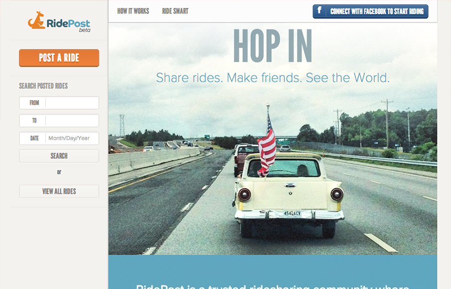
I like the fixed window feel to this design. With the header and sidebar staying put the section that scrolls gives the site a real app-like feel. I do wish it was responsive, it would make a lot of sense too for the site/app I think. My favorite part is the icon/illustration section where the page informs you on what RidePost is. It’s clear and concise and works non-linearly which is great because the idea of the app is a bit complicated.


The Call to Action, Revisited
The Call to Action hasn’t changed in a decade, but the bar has. A fresh look at prominence, copy, mobile tap targets, and accessibility, with lessons from three major design systems.


Re: responsiveness => I’m working on it 🙂
Need more designers/developers… I’m by myself!