
by Maria | Aug 31, 2012 | Gallery
The emma website is very crisp. I dig that top nav and how crisp and brite it looks to me. The “get started” call to action is easy to find and understand and I like that it’s echoed on the page a couple of times. The overall layout gets more dense...
by Gene Crawford | Aug 28, 2012 | Gallery
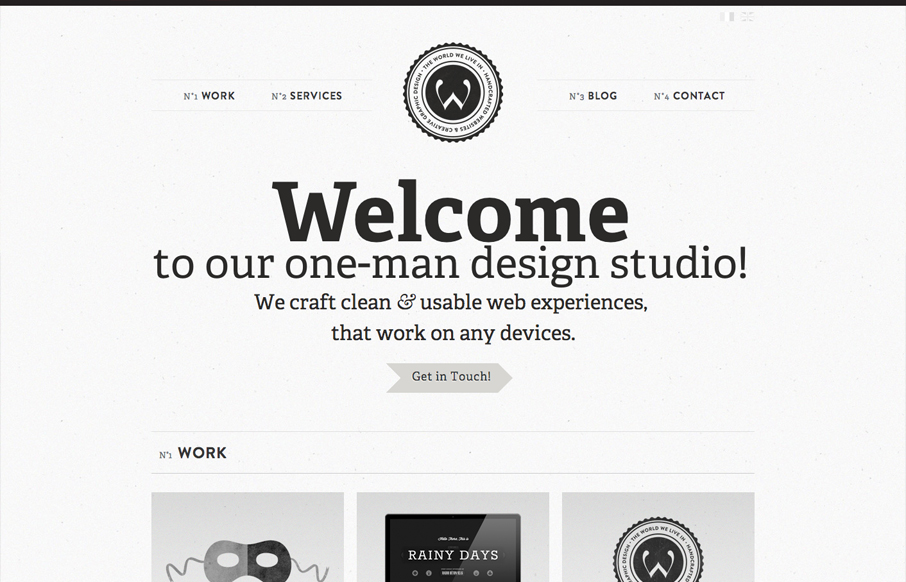
Another solid minimal(ish) design that’s great. I love the bold typography and black and white coloring. Keeps it all very clean feeling. Then those charts of skill-sets are very craftily done.
by Gene Crawford | Aug 27, 2012 | Gallery
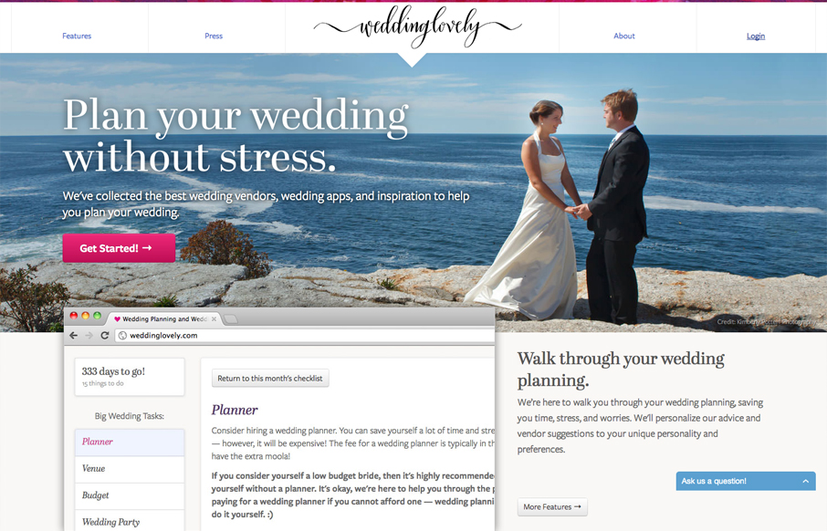
Submitted by: Andrey Petrov @shazow Role: Designer & Developer WeddingLovely brings classy and stylish wedding websites to the average wedding couples with affordable prices. Finally your wedding destination site will look as gorgeous as your wedding. Nice clear...
by Giovanni DiFeterici | Aug 24, 2012 | Gallery
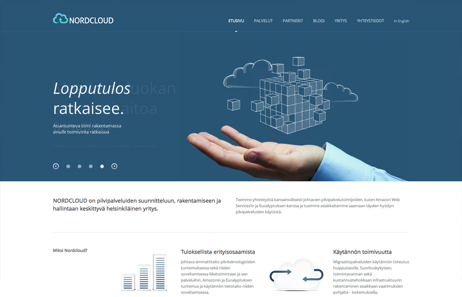
Submitted by: Samuli Nivala @buena_fi Role: Designer & Developer Nordcloud is a perfect example clean, sensible web design. It’s certainly not the flashiest site that I’ve reviewed, but it is tastefully simple and extremely usable. I would like to see...
by Gene Crawford | Aug 24, 2012 | Gallery
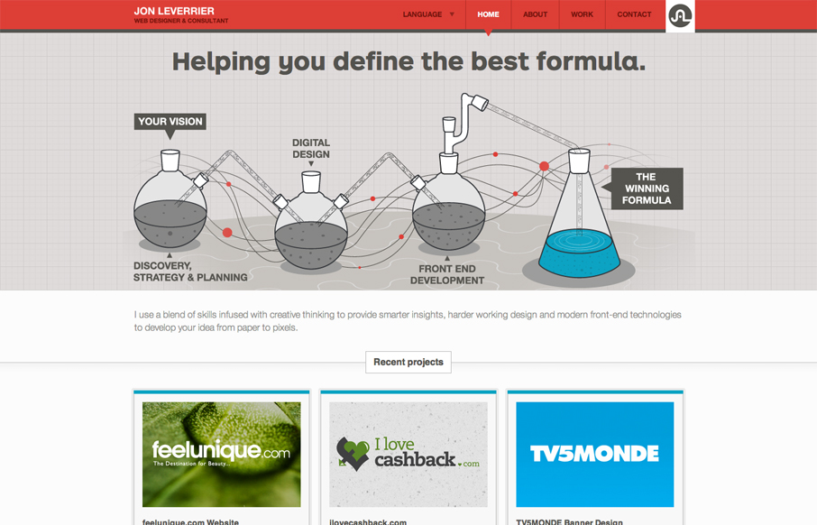
Fun looking design that’s very business oriented at the same time. The main illustration is nice and the small interactions on it give me a certain level of enjoyment to check out. While the overall tone is clear and focused and get’s to the point there is...