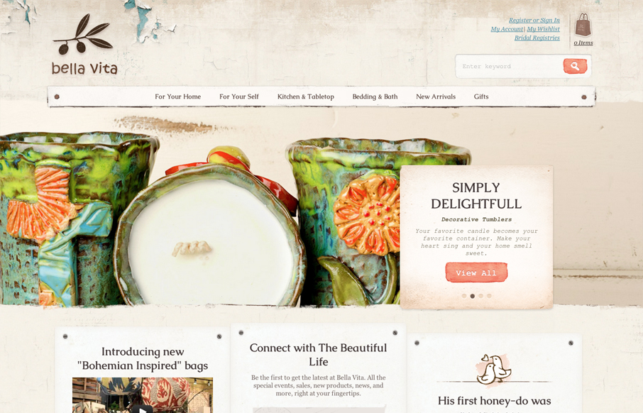
by Gene Crawford | Jul 30, 2012 | Gallery, Shopping
What I like most about the Bella Vita website is the consistency that the textures and colors are used. I love that search button, the same esthetic is echoed throughout the site’s details too, like on the back and next interactions on the slideshow. The main...

by Gene Crawford | Jul 25, 2012 | Gallery, Medical
There’s a kind of rough and unfinished feel to the shapes/illustrations here. I’m sure it’s on purpose when you consider the scope of execution on this website. The responsive design and other details leave me with this feeling. I especially love the...
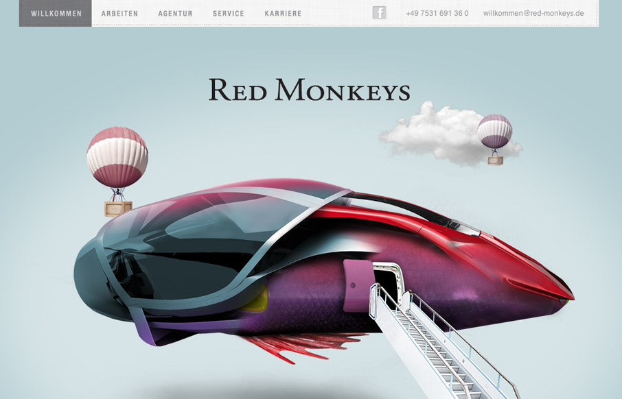
by Gene Crawford | Jul 24, 2012 | Design Firm, Gallery
Nice mix of fantastical illustration and parallax here. It’s fun and keeps you engaged with enough eye candy then the visual structure behind it delivers what it needs content wise. One little detail I both like and dislike is the tool tip that shows the...

by Gene Crawford | Jul 23, 2012 | Design Firm, Gallery
Really love the parallaxy effect with the background images and the main text/copy on the home page it makes a nice stark difference between the home and sub pages. THe use of different colors for each sub page is nice overall design decision too. The website feels...

by Gene Crawford | Jul 19, 2012 | Gallery
I like the simple way in which this design shows off how to use the app and what it does with drawings of the hands using it. It’s straight forward and feels simple enough. The design is plush with textures and that plays nicely off the iPhone photo really well....
