by Gene Crawford | Jun 13, 2012 | Gallery
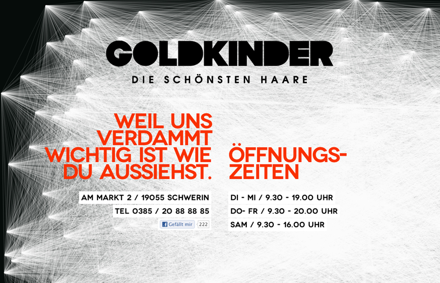
Paralax Scrolling html5 site for a hairstylist from schwerin / germany Submitted by: herrlich media @fimbim Role: Designer & Developer Cool interactions on this parallax design. I like the stark black and white and the way the lines animate in on page load. Then...
by Maria | Jun 13, 2012 | Gallery, Travel
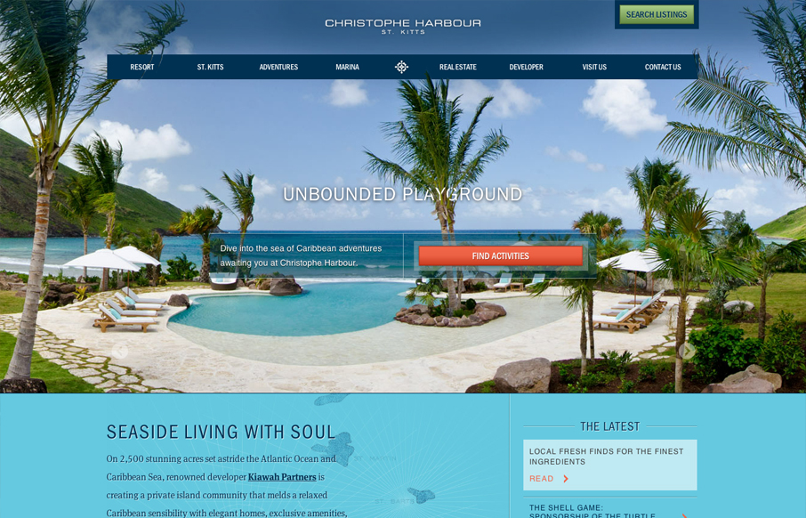
There’s truly a whole lotta sexy going on with this site. Aesthetically and developmentally it’s a site full of rich treasures. No exaggeration. I almost don’t want to point anything out and just let you experience it on your own, but I suppose I...
by Gene Crawford | Jun 12, 2012 | Gallery, Screencast Review
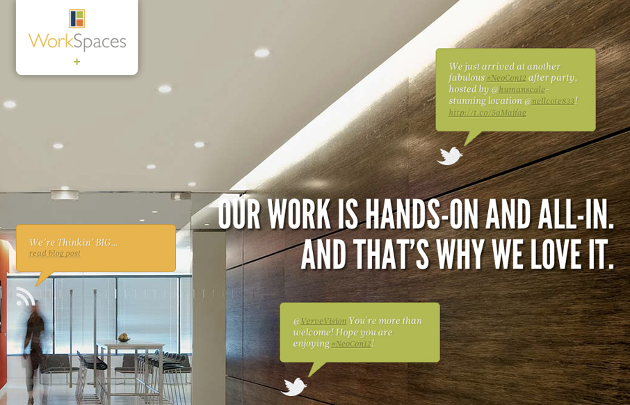
I love the look and execution of the WorkSpaces website. The responsive design and parallax effect with the main images is quite well done. It gives an overall timeless feeling design some current edge. Typically I don’t like it when a design hides navigation...
by Gene Crawford | Jun 12, 2012 | Gallery
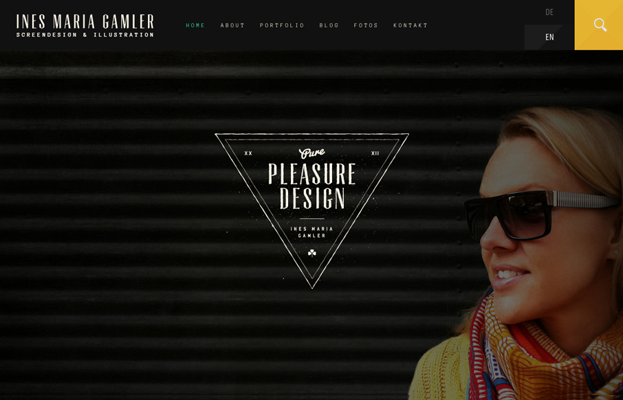
Very nice textural and layered design. I love the feel to this site design, the dark header and footer areas with the light background content section in between on the homepage is a nice way to ground the page. The typography is well done all across the website as...

by Richard Robinson | Jun 11, 2012 | Gallery
Okay, so I might be cheating a bit with this review, but when I saw this yesterday, I just had to write about it. While I do like the landing page for Just Landed, the helpful video of the app in action, the little touches like the animated clouds and jet to drive...