
by Gene Crawford | Aug 6, 2012 | Gallery
The diagonals really make this website dynamic visually. The flat shapes of color laid on top of the textured background image also adds to the visual interest to keep you looking. I find the colors a bit muted personally but it still works tone wise when you read the...
by Giovanni DiFeterici | Aug 2, 2012 | Community / Social Networking, Gallery
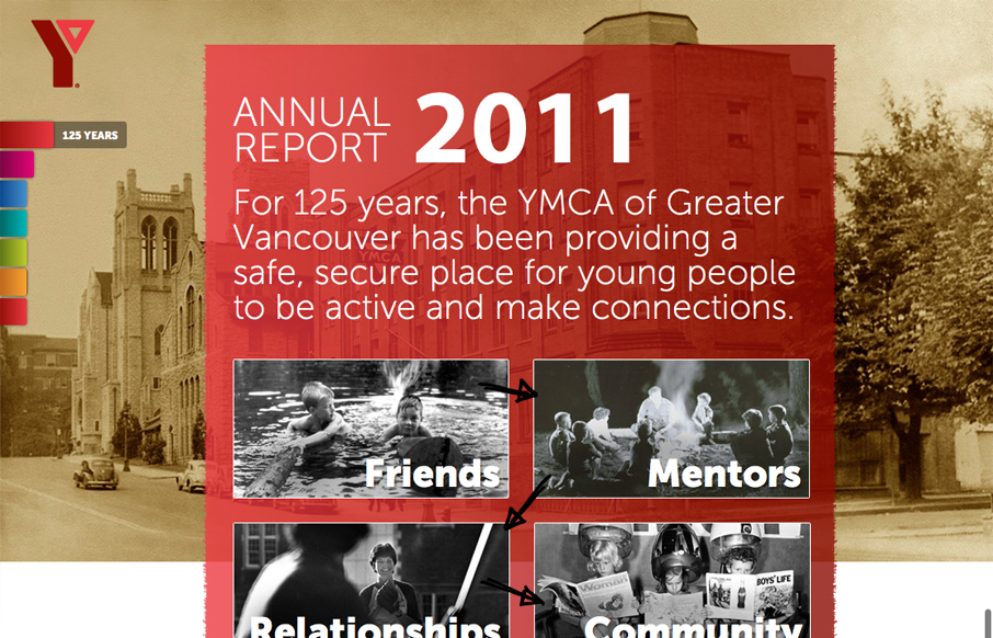
imagineourymca.ca is clearly designed to push the brand and to present a lot of information in a tight little package. I really like how the ‘pages’ have so much activity without getting in the way of the content. I especially enjoy the community sections...
by Giovanni DiFeterici | Aug 2, 2012 | Gallery, Travel
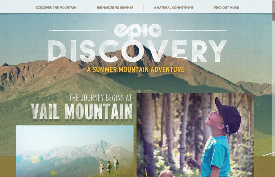
epicdeiscovery.com is a lovely little site with a whole lot of personality. It’s clearly designed to get a user to want to be out in nature and I think it succeeds beautifully. While structurally complex, the content is fairly minimal as are interactions. Each...
by Gene Crawford | Aug 1, 2012 | Conference, Gallery
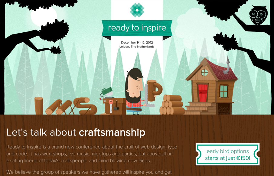
The 2012 Inspire Conference website is wonderfully illustrated. I like the little lumberjack dude and how it’s all tied into the theme. Nice responsive design too. Lovely site and it looks like a kick-ass conference too!
by Gene Crawford | Jul 31, 2012 | Gallery, Portfolio
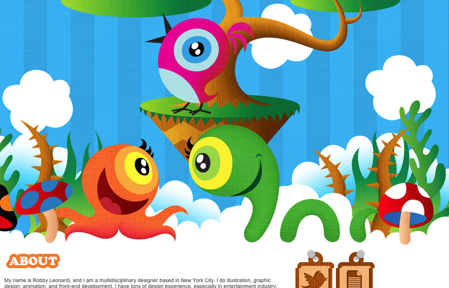
Submitted by: Robby Leonardi @rleonardi Role: Designer & Developer Great illustrations mixed with some interaction like this is a win. I love the sideways parallax and the way the other items animate into view as you scroll down. Fun and lite the design here is...
