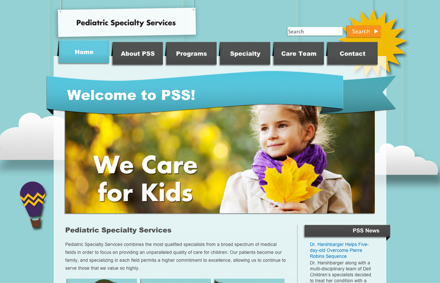
There’s a kind of rough and unfinished feel to the shapes/illustrations here. I’m sure it’s on purpose when you consider the scope of execution on this website. The responsive design and other details leave me with this feeling. I especially love the feel that you get when you reach the footer on the home page as you scroll down.
Glassmorphism: The Transparent Design Trend That Refuses to Fade
Glassmorphism brings transparency, depth, and light back into modern UI. Learn how this “frosted glass” design trend enhances hierarchy, focus, and atmosphere, plus how to implement it in CSS responsibly.


0 Comments