
by Matt Keogh | Dec 5, 2013 | Gallery
I sometimes wonder whether the ubiquity of sites that use scrolling for animation and parallax effects will come to define a period in web design in a way that “Flash/DHTML” sites now do. Having said that, for the time being let’s just enjoy this visual feast – of...
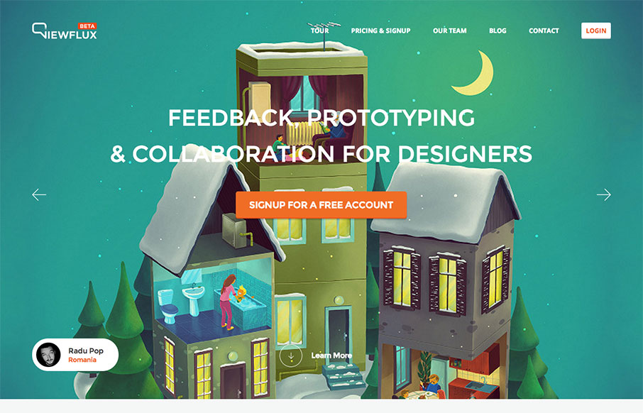
by Gene Crawford | Dec 2, 2013 | Gallery
I like the implied simplicity of the viewflux site design. It starts off with large photos in a slideshow which seem noisy visually but then it tapers off into some really nicely done grid layout and easy to read copy design. I particularly dig the way the tour page...
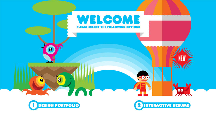
by Gene Crawford | Oct 30, 2013 | Gallery, Portfolio
Both his portfolio and resume are cool, but mainly go check out the resume page of this site. Fantastic stuff. This is a really neat take on a single page website design that employs scrolling as primary navigation across the site. Great illustration work and cool...
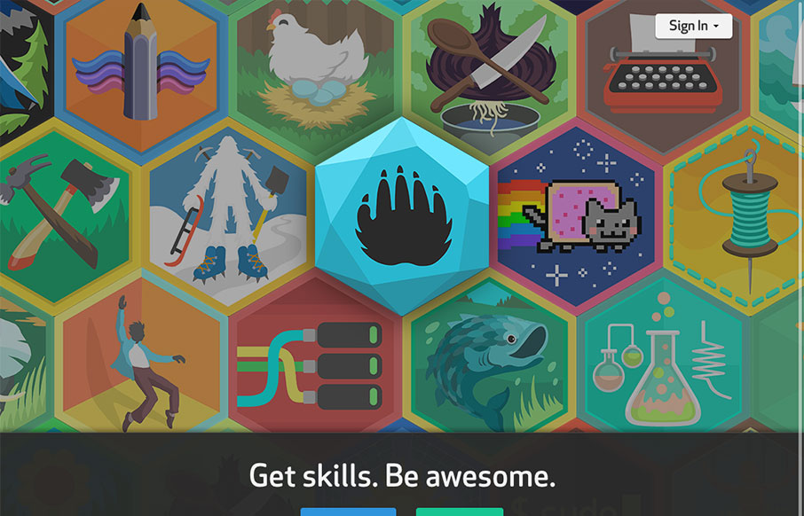
by Maria | Oct 23, 2013 | Gallery
This site is all kinds of interesting. It teaches kids new skills and through the power of social media, it connects them to others that share their interests. Honestly, it looks like a heckuva lot of fun for any age. The design is solid – with 3 streamlined...
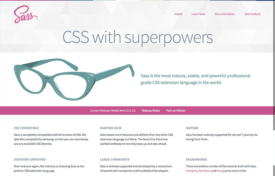
by Gene Crawford | Oct 23, 2013 | Gallery
The new Sass site! It’s what you’d expect, good quality simple design. The new logo is quite nice, very succinct and direct, it’s a good mark. Nice illustration of the glasses too. This site has to do so much, it has to be easy to read through, fast...