by Matt Keogh | Aug 10, 2016 | News
I hope this article doesn’t come across as arrogant or with a ‘know it all’ attitude. These are topics that as web designers, we consider everyday. It’s only by thinking about these on a daily basis that their significance becomes apparent. We design systems, not...

by Matt Keogh | Jun 2, 2015 | Gallery, Sports/Recreation
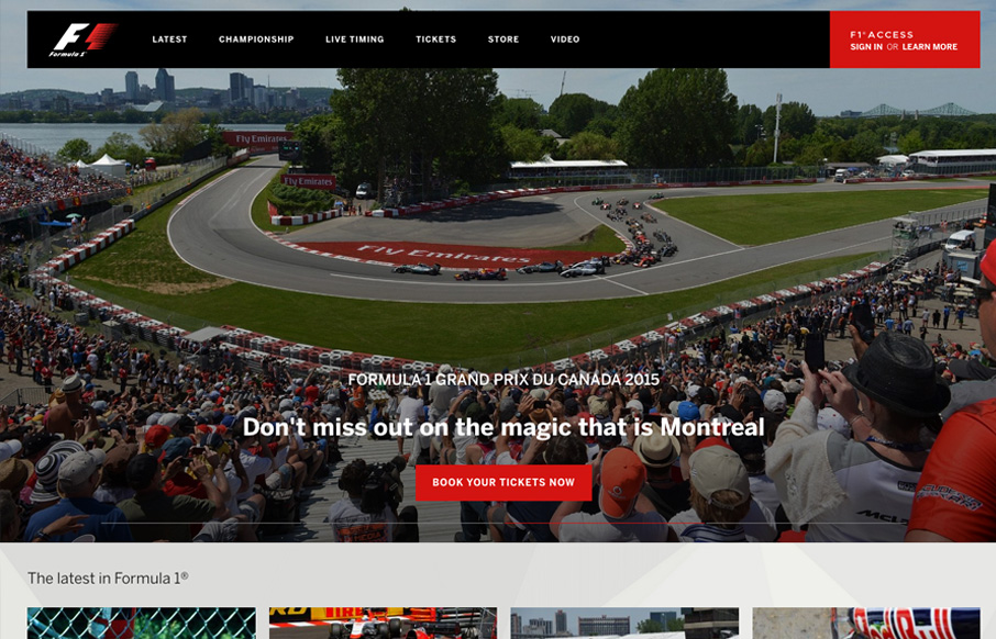
As expected from Formula 1, this is a slick, solid and bold website. The first thing to grab you is the quality of the large and spectacular images on the home page. As a designer, if you’re given images such as these to play with you know your design is going to be...

by Matt Keogh | Mar 2, 2015 | News
A large proportion of people in the web design industry are of the opinion that it isn’t an issue if people need to scroll to see content and images. Why is it then that this seems to be a big issue for clients who will often feedback that they don’t get to see...

by Matt Keogh | Feb 11, 2015 | Food and Beverage, Gallery
This site is all about the tone for me. Big bold text on the home page set in a simple none fancy sans-serif font. Bold, earthy, homely imagery – love whatever filter they’ve used on these. The design could have easily gone down a more handcrafted/organic/market...

by Matt Keogh | May 12, 2014 | Gallery
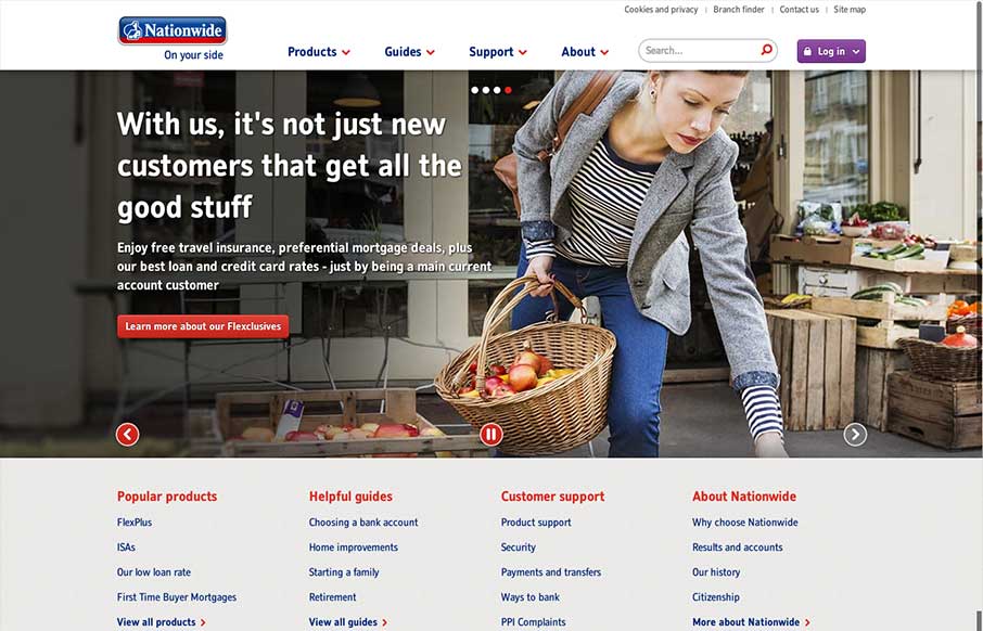
In comparison to other major banking websites (in the UK at least) the recently re-designed Nationwide website is brave and modern. There’s nothing particularly fancy about it which in a way is what you’d expect and want from a website such as this. It is...
