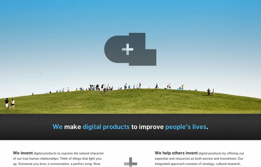
by Gene Crawford | Mar 28, 2012 | Gallery
The new Crush Lovely website is simple and direct. I really dig how the tone is mainly delivered with copy and such. The “select clients” and “imagined future clients” stuff is pretty smart. The super large contact form with the large text box...
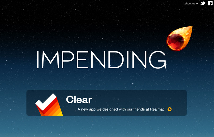
by Gene Crawford | Mar 28, 2012 | Blog, Gallery
Beautiful blog/website design by the team (partly) that made Clear. I love the crystal comet and that animation and the overall character the design gives the site. The footer is well done too and carries the visual tone all the way through.
by Gene Crawford | Mar 26, 2012 | Conference, Gallery
I can really appreciate a simple approach to a website – especially a conference website. I like the three column design, keeping things front and center like uxmad.com is doing. Kinda screams to be responsive too.
by Maria | Mar 26, 2012 | Gallery, Marketing
Soleil Noir’s 2012 wishes is just plain fun to play with. Vertical parallax meets bright happy colors, simple messaging, and some animations to add another slight layer of wow. The nav on the side is neat. Choosing a colored dot is like picking an easter egg not...
by Maria | Mar 22, 2012 | Gallery
This is a super straightforward and attractive site. The rich images create a consistent visual experience that almost feels like a story. Also, there’s more content to this site than you might initially think, but it’s all organized well and easy to...