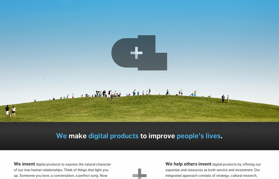
The new Crush Lovely website is simple and direct. I really dig how the tone is mainly delivered with copy and such. The “select clients” and “imagined future clients” stuff is pretty smart. The super large contact form with the large text box is also smarty used. It’s responsive of course and makes you feel good as a designer as you check it out.


The Call to Action, Revisited
The Call to Action hasn’t changed in a decade, but the bar has. A fresh look at prominence, copy, mobile tap targets, and accessibility, with lessons from three major design systems.


0 Comments