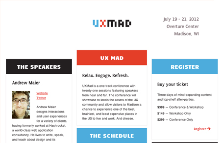
I can really appreciate a simple approach to a website – especially a conference website. I like the three column design, keeping things front and center like uxmad.com is doing. Kinda screams to be responsive too.


The Call to Action, Revisited
The Call to Action hasn’t changed in a decade, but the bar has. A fresh look at prominence, copy, mobile tap targets, and accessibility, with lessons from three major design systems.


Such a great conference site. It makes everything you want to know as a conference-go-er ridiculously clear and easy to find.
You going to that Chris? Being near your old hometown right?