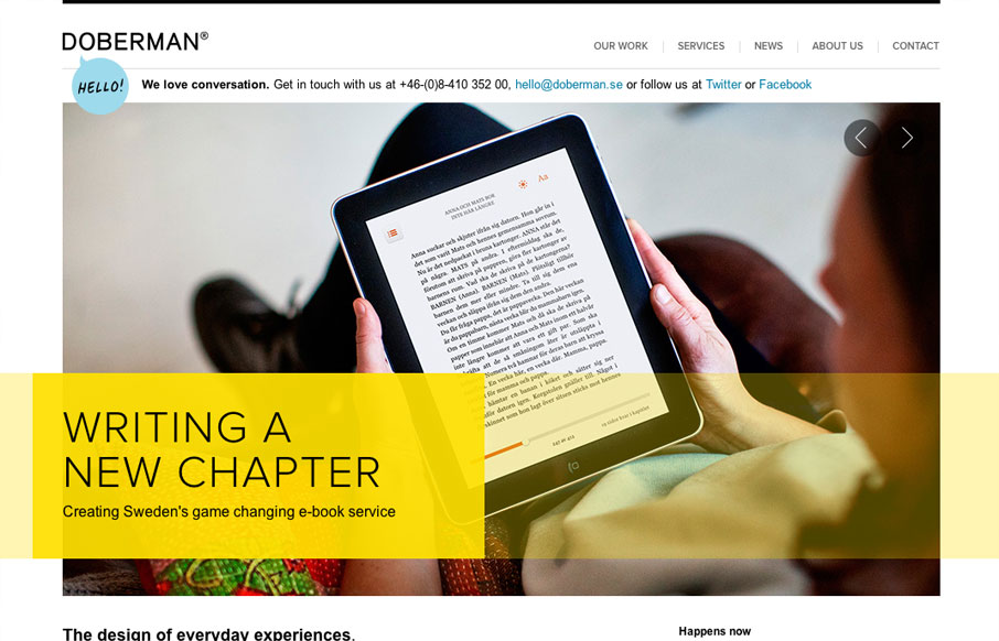
by Gene Crawford | Apr 5, 2012 | Gallery
I really dig the hierarchy designed into this home page. The large image/slideshow is nice with nice details and you get t focus on that, with simple messages and then as you scroll down the info gets more densely populated and then eventually just some basic about...
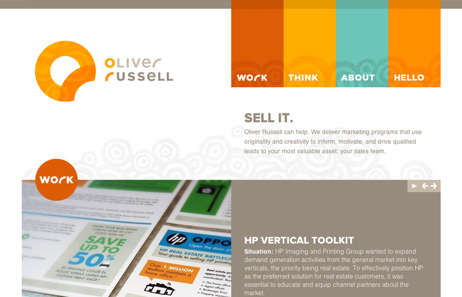
by Gene Crawford | Apr 5, 2012 | Gallery
I like the two main column layout for this website. The use of the circles and overall blocky feeling of the design makes for a nice contrast, especially with the circular swirly pattern behind the main elements. The responsive design for this site is pretty well...
by Gene Crawford | Apr 4, 2012 | Gallery, Marketing
Very fun parallax website. Super great execution too. The best part is the way it’s used to view different sets of cloths over the model. But the bottom nav slides into place and you can then use the up and down arrows to load the clothes. I love clever usage of...
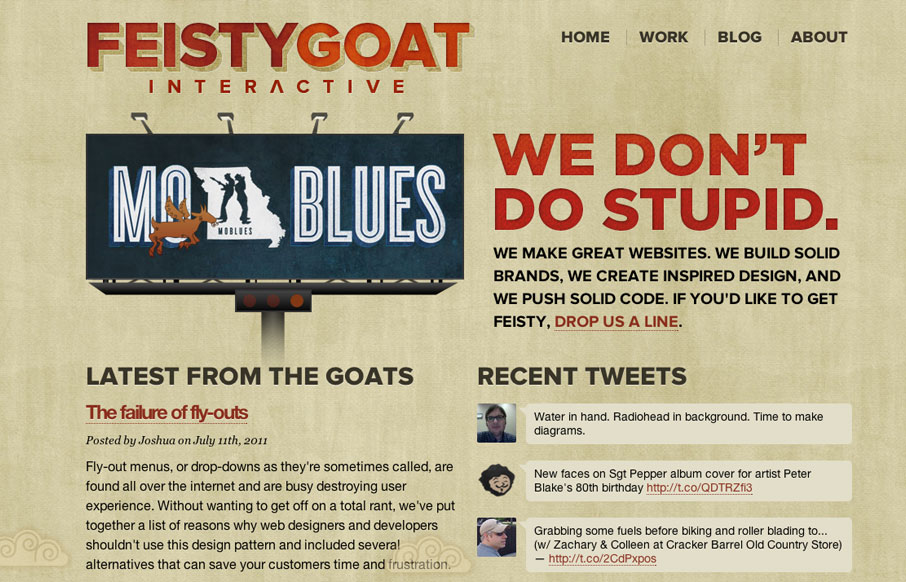
by Gene Crawford | Apr 4, 2012 | Design Firm, Gallery
I love the bold two column layout of the Feisty Goat website. The animations are fun and the overall tone is indeed feisty. I really like that they have thought out their brand’s tone so fully and push it with the copy and everything. In this case it really...
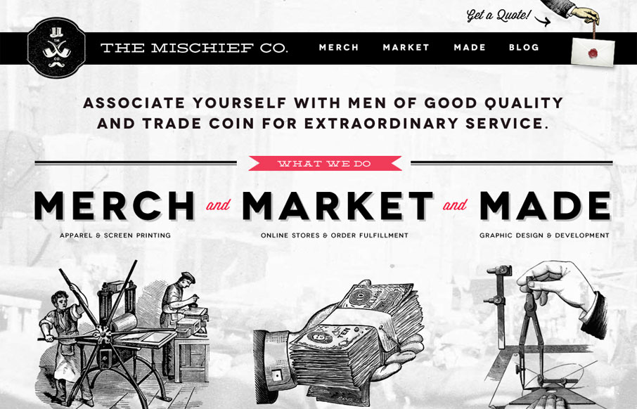
by Gene Crawford | Apr 4, 2012 | Gallery
The Mischief Co’s visual branding is quite fun. It’s somewhere between olde school and future classy (heh, I just made that up.) But I love it, it’s fun and that’s just what a site like this needs right? Technically it’s put together well...