
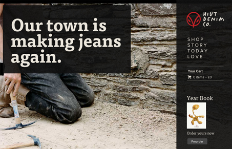
This is a super straightforward and attractive site. The rich images create a consistent visual experience that almost feels like a story. Also, there’s more content to this site than you might initially think, but it’s all organized well and easy to navigate to. I like the overlays and limited use of color, especially with the photography used. Overall it’s a uniquely crafted site that echoes the same qualities in their products.


Fitts’s Law: Why the Easy Button Wins
Large, close targets are faster to hit than small, distant ones, that’s Fitts’s Law. A look at the 1954 rule behind buttons, prime and magic pixels, thumb zones, and dark patterns.


0 Comments