by Gene Crawford | Dec 12, 2013 | Gallery
I really dig the new Skookum website design. It’s very clean and professional feeling but also has a vibe that is counter to an overly technical appeal. There is just enough movement and little surprises tucked away here and there to keep a level of dynamism in...

by Gene Crawford | Dec 3, 2013 | Gallery
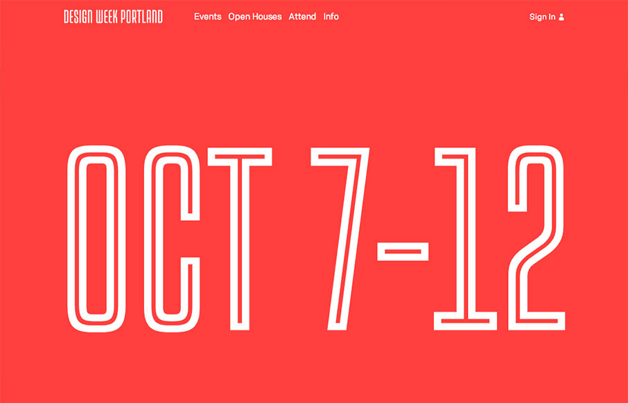
I love the Design Week Portland 2013 site design. The way the images flow through in the main image area as you scroll down the page is a very cool interaction. Taking your mouse away from the area makes the image disappear as well. I like the rest of the layout too,...

by Maria | Nov 11, 2013 | Gallery
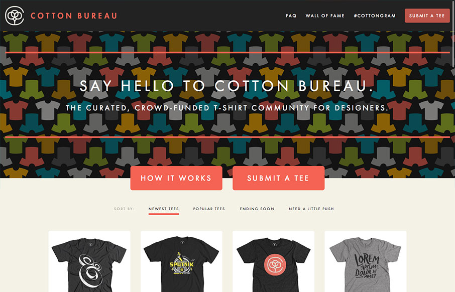
Cotton Bureau is a curated, crowd-funded t-shirt community for designers brought to you by Full Stop; the brains and braun behind United Pixelworkers. It’s a great concept with an equally solid site. I think there’s a good balance between Cotton Bureau and...

by Maria | Oct 30, 2013 | Gallery
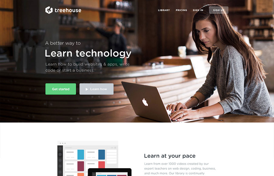
Newly updated design for Treehouse. The design is incredibly focused and direct yet at the same time the photography and illustrations are open and inviting feeling. The color palette also plays on the essence of making you feel relaxed. Good responsive work here too,...

by Gene Crawford | Oct 23, 2013 | Gallery
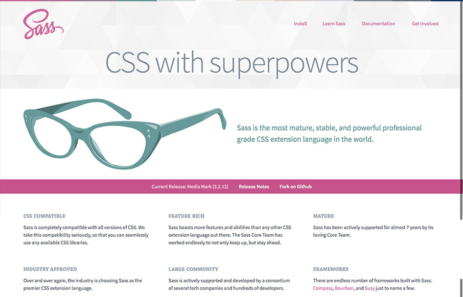
The new Sass site! It’s what you’d expect, good quality simple design. The new logo is quite nice, very succinct and direct, it’s a good mark. Nice illustration of the glasses too. This site has to do so much, it has to be easy to read through, fast...


