by Gene Crawford | Feb 4, 2014 | Gallery
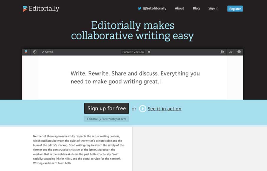
This may not sound like the smartest review; but I love websites that are mostly words and wind up feeling like they are graphically rich. The Editorially site does just that. It’s a website selling and app that’s built for writing where all the crud of a...
by Gene Crawford | Jan 28, 2014 | Gallery, Shopping
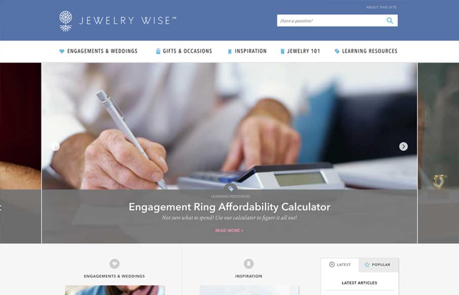
The Jewelry Wise website is a great example to study if you’re considering one of those mega-navs. This design utilizes it quite well on both the desktop and mobile versions of the design. The page also has good rhythm and leads you down the page in a succinct...

by Giovanni DiFeterici | Jan 8, 2014 | Gallery, Sports/Recreation
Fitstar is a beautiful site that uses animations to quickly focus the viewers attention on the most important content in the viewport. The effect is engaging and varied enough to stay interesting. Each transition and animation is appropriate the the content and...

by Gene Crawford | Jan 6, 2014 | Design Firm, Gallery
The new Adaptive Path website is “as always” a thing of beauty. There really is a lot going on here when on the surface it looks like a simple design. From the slight movement of the top header/navigation, to show you it’s there, down to the overall...
by Giovanni DiFeterici | Jan 6, 2014 | Gallery
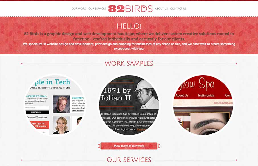
82birds has a lovely handicraft feel that pairs well with the company’s brand. The typography is nicely balanced by the textural elements peppered throughout the site. I especially like the thin line dividers that bookend page titles.