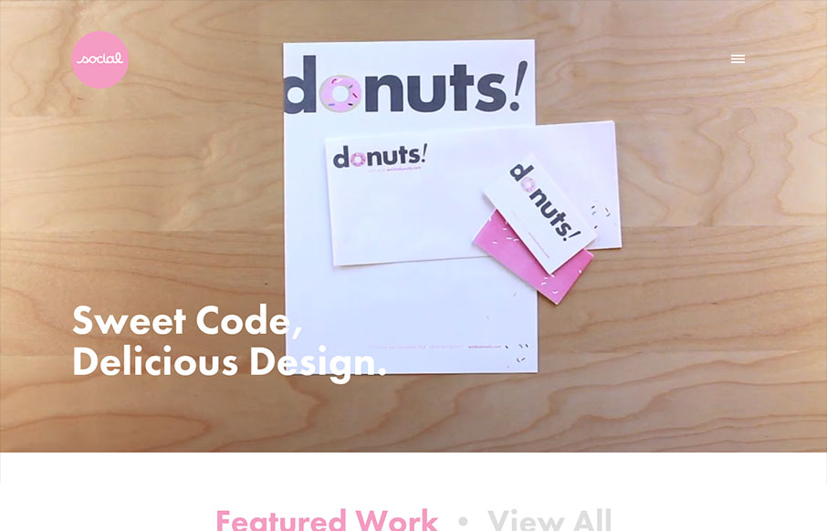
by Maria | Oct 21, 2013 | Design Firm, Gallery
I’ve always like the video on Social’s home page, so I’m glad they’ve found ways to utilize it with each redesign of the site. I especially like the consideration they take when the site’s viewed on a smaller device. It’s smartly...
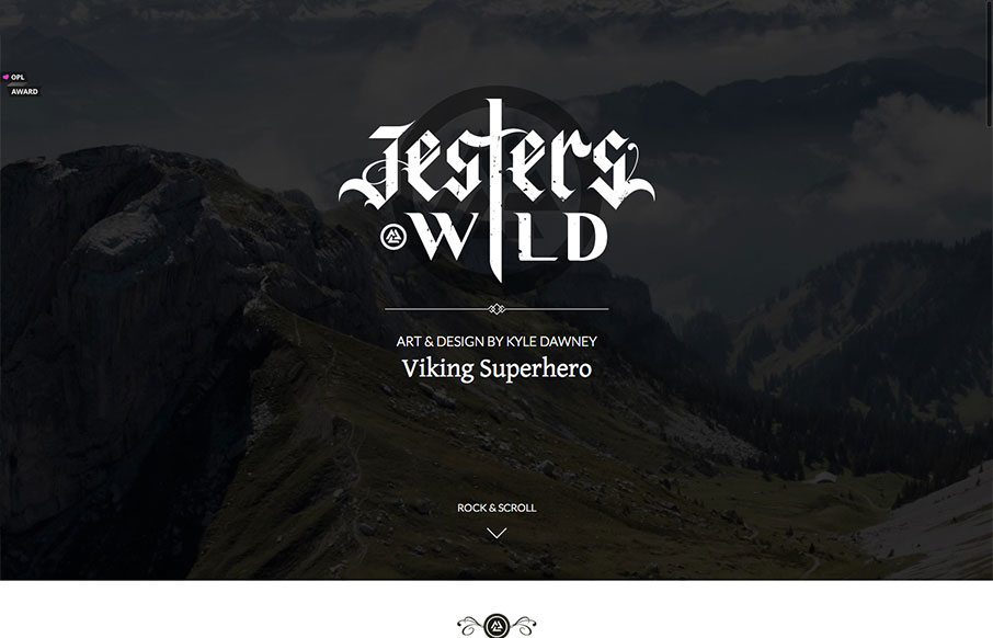
by Gene Crawford | Oct 21, 2013 | Gallery, Portfolio
Really simple execution and layout for this portfolio site but overall I really dig it. Slight animation on the text and then the slight parallax on the top most background image give it some really nice details. Down to the bottom with the skills graph – this...

by Maria | Oct 7, 2013 | Gallery
A rather straight forward site design, using some of the latest cool stuff. But something about it, maybe the clean layout and/or easy going vertical rhythm makes it sing to me. My favorite part is the “clients” drop down section under the header. Very...

by Gene Crawford | Oct 2, 2013 | Design Firm, Gallery
I love the simply stated yet perfectly executed design of the Lullabot website. The rhythm of this site is superb as you scroll down the page. Everything just queues up perfectly for you. The site starts off as a place to get into what type of work the firm does, then...
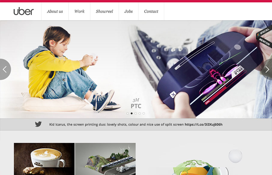
by Gene Crawford | Sep 4, 2013 | Gallery
Pretty standard layout here but it has enough little bells and whistles to keep it feeling quite fresh. I love the slight squeeze that the main nav across the top does as you scroll down. It’s enough to make you notice it and follow it. The rest of the layout...