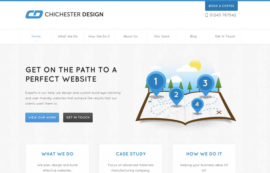
by Giovanni DiFeterici | Mar 20, 2014 | Gallery
The Chichester Design website is deeply invested in it’s content. Every page has a custom structure and the content is coupled with a variety of illustration to convey a message clearly. The tight design and friendly aesthetic are engaging and easy to read....
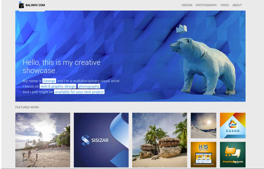
by Gene Crawford | Mar 18, 2014 | Gallery, Portfolio
Clever looking design. I like the Isotope interface piece and how it’s used, in that the design isn’t just based on using it. Beautiful work too.
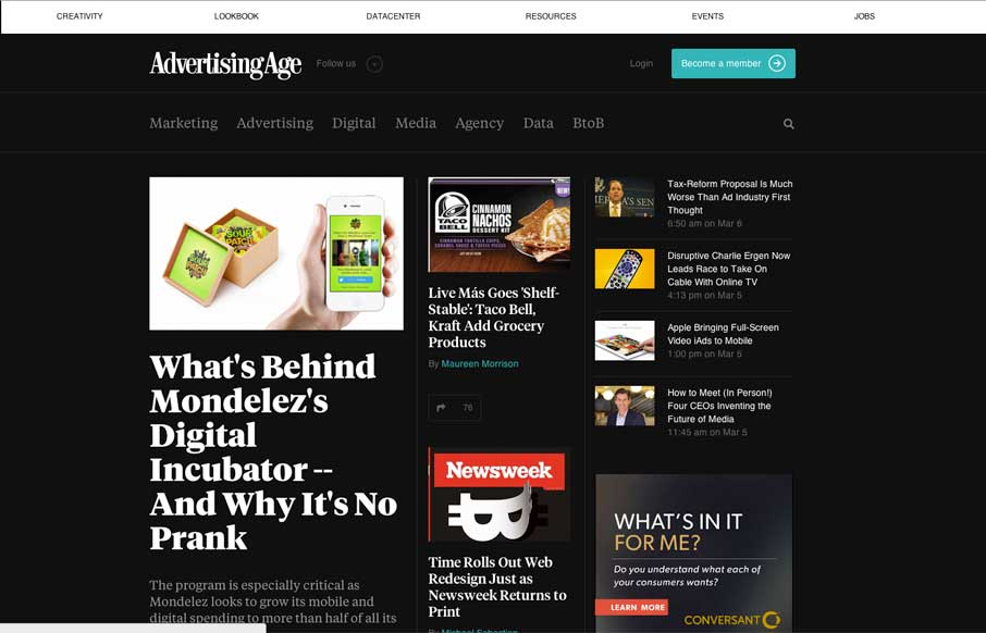
by Gene Crawford | Mar 14, 2014 | Gallery, Marketing
I dig the new Ad Age website. I like the top section that has the black background and how it uses that section for featured content. As you make your way down the page there’s some nice “sectioning” of specific styles of content. I love how the...

by Gene Crawford | Mar 14, 2014 | Gallery
The Five Simple Steps isn’t one of those sites that has tons of interactions and moving elements. But the design is simple and effective. I really like how the main hero image/area isn’t just a big JPG, that’d be lazy, they add the extra effort and...
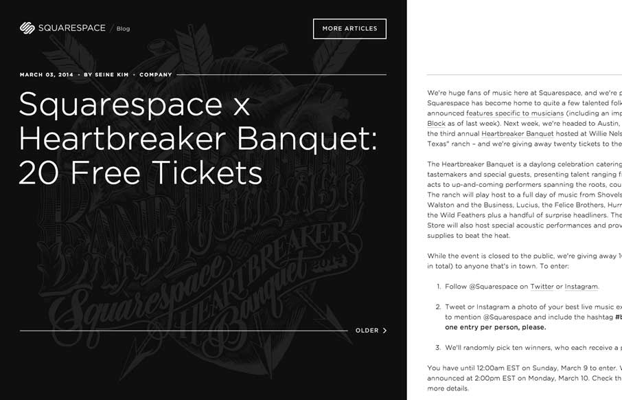
by Gene Crawford | Mar 11, 2014 | Blog, Gallery
The Squarespace Blog is very simple at first glance. Keeping all the relevant content for the post (or most recent post) front and center. You can slide open a list of past posts, that have nice little hover effects of the images. On the right is the now standard...