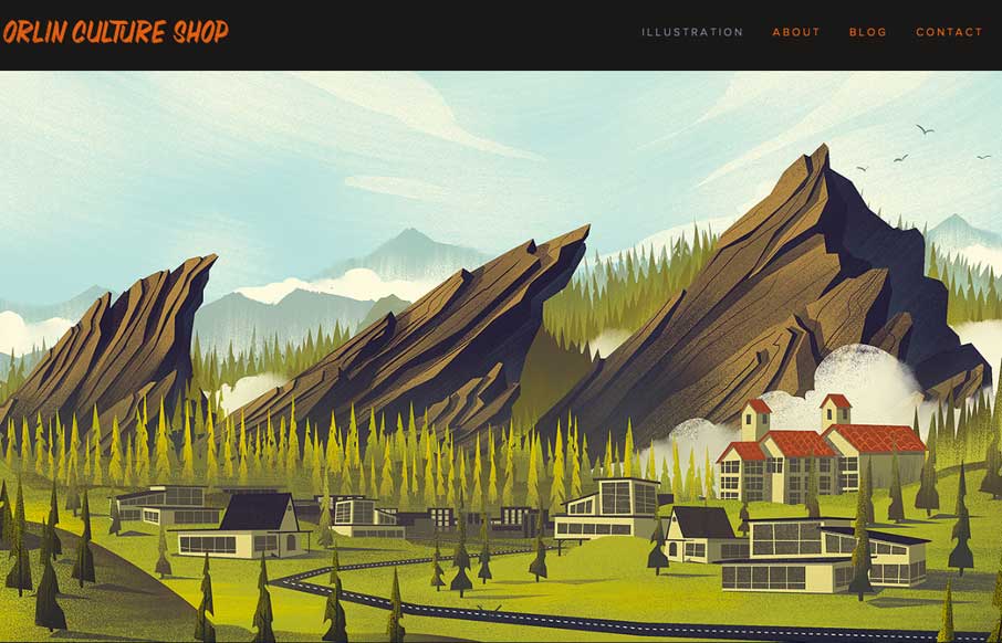
by Gene Crawford | Apr 10, 2014 | Gallery
Super simple and elegant way to show off your work for an illustrator. I get to just sit here and scroll down the page and take in all this succulent work. Mmmm.
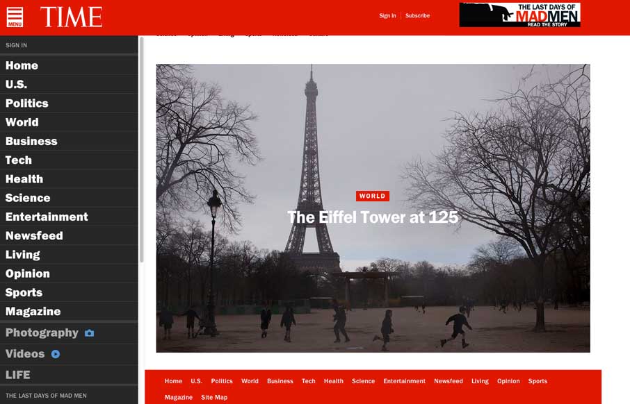
by Gene Crawford | Apr 4, 2014 | Gallery
Really great transition to a responsive website from Time Magazine. It’s really beautifully done. There are also sections like this World Trade Center article that show they are really trying to push the boundaries of online writing. Well done.

by Aaron Griswold | Apr 3, 2014 | Gallery
Pretty nifty site design. I like how the main nav stays fixed but in the box shape that overlays the site. Also, resize this badboy, that’s a cool way to hide the transitions but also making it interesting for us that build sites too. Bravo.
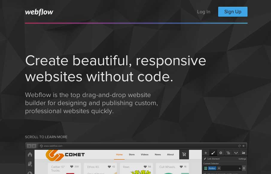
by Gene Crawford | Mar 26, 2014 | Gallery
Pretty much a flat organized page here with the Webflow site. It works well in this case, considering their audience. I love how the main featured image fades out as you slide down the page. The signup form all lined up horizontally looks very quick to get through...
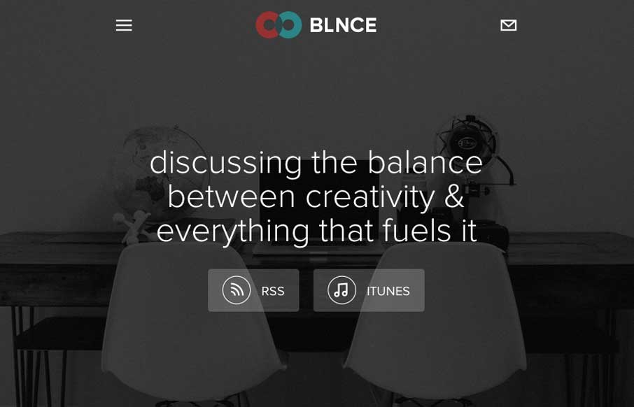
by Gene Crawford | Mar 26, 2014 | Gallery
Really nice simple layout for this podcast series. There’s been a swath of podcasts being created the past few years and as a result we get to see lots of different looks at how people handle the site designs. This one is one of my favorite designs.