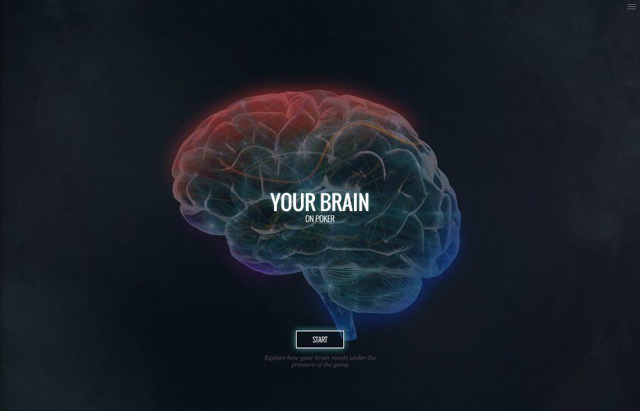
by Gene Crawford | May 13, 2015 | Entertainment, Gallery
Interesting technical website. I like the way you interact with the sections and the animations of the brains are well done indeed. It starts to feel more like a slideshow than a web app or website in the end. That’s not to say it’s wrong, just what it...
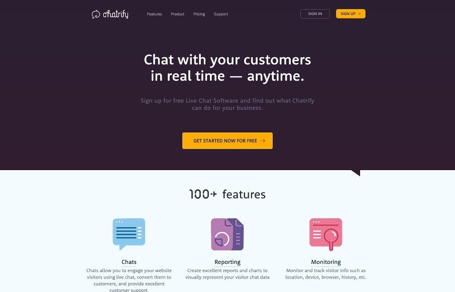
by Gene Crawford | May 13, 2015 | Gallery
As product websites go the one for Chatrify is pretty stellar. Sleek and simple and packed with some badass icon designs. I love this mighty little site. Super great stuff here. From the Designer: Chatrify is Live chat software that engages your website visitors in a...

by Gene Crawford | May 12, 2015 | Gallery
Pretty tight agency website. It has all the hallmarks of a good agency site and is also very well done. The grid is strong and easy to scan and there’s enough little pieces to make it feel good as you scroll and interact with it. They also have some really...
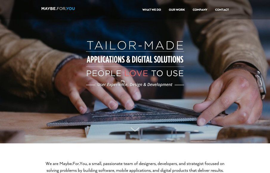
by Gene Crawford | May 11, 2015 | Gallery
I’m starting to see A LOT of websites that look really similar in their structure and layout. Leaving the differentiators to the photography and copy. Sometimes someone will put in a bit of elbow-grease and make the interactions really shine. The Maybe.For.You...
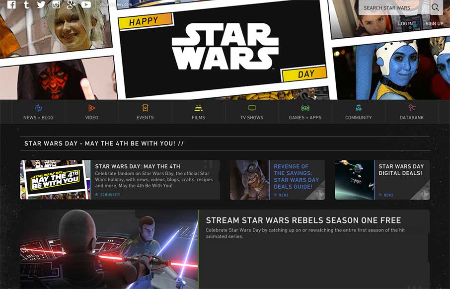
by Aaron Griswold | May 4, 2015 | Entertainment, Gallery
But first – May the Fourth Be With You We plan always review the Star Wars site for May 4th – because, that’s what you do on May 4th if you run a web design inspiration gallery for geeks and nerds all across the universe (or world – we’re...